 Nine
Nine
Main bedroom and walk-in wardrobe week on The Block may not have an ominous-sounding nickname like “hellway week” or inspire the same kind of planning anxiety as bathroom week, but it’s the room’s unassuming simplicity that can bring even the most experienced Block couple undone (Ronnie and Georgia once came fourth during main bedroom week despite Neale Whitaker calling their space “the most beautiful master bedroom I’ve seen on 11 years of judging The Block” because their walk-in robe was too small).
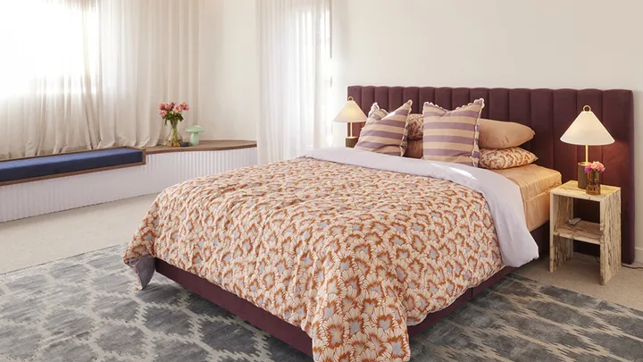
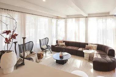
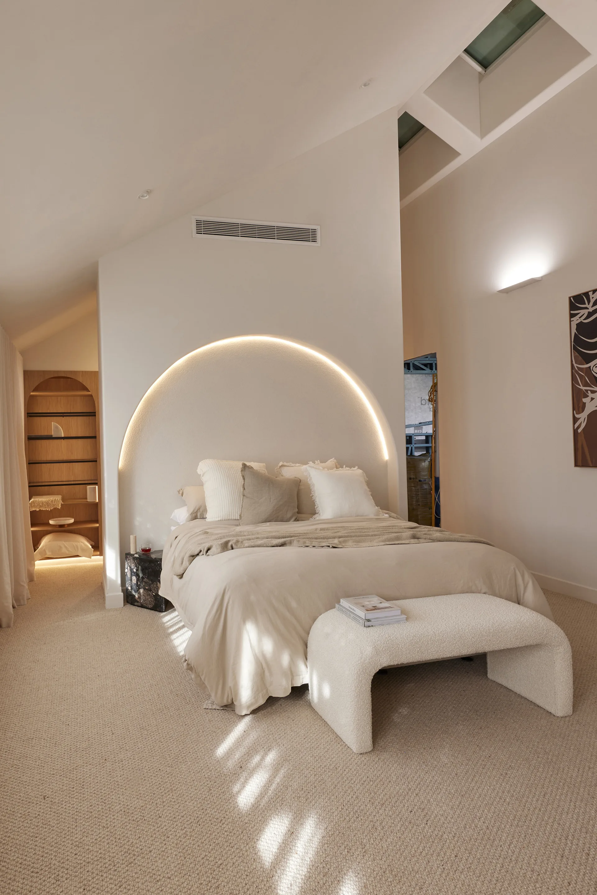
So how did this week’s contestants fare? They all managed to present beautifully-styled master bedrooms – complete with fluted ceilings, rendered statement archways, venetian-plaster feature walls and “cathedral-like” proportions – so the judges really had to split hairs over functionality to separate the good from the great.
While Steph and Gian in House 4 were ultimately awarded the win for their “luxury, luxury, luxury” main suite, it wasn’t all sunshine and daisies. Here are three of the main mistakes the contestants made with their main bedrooms and walk-ins and how you can avoid making them in your own home.
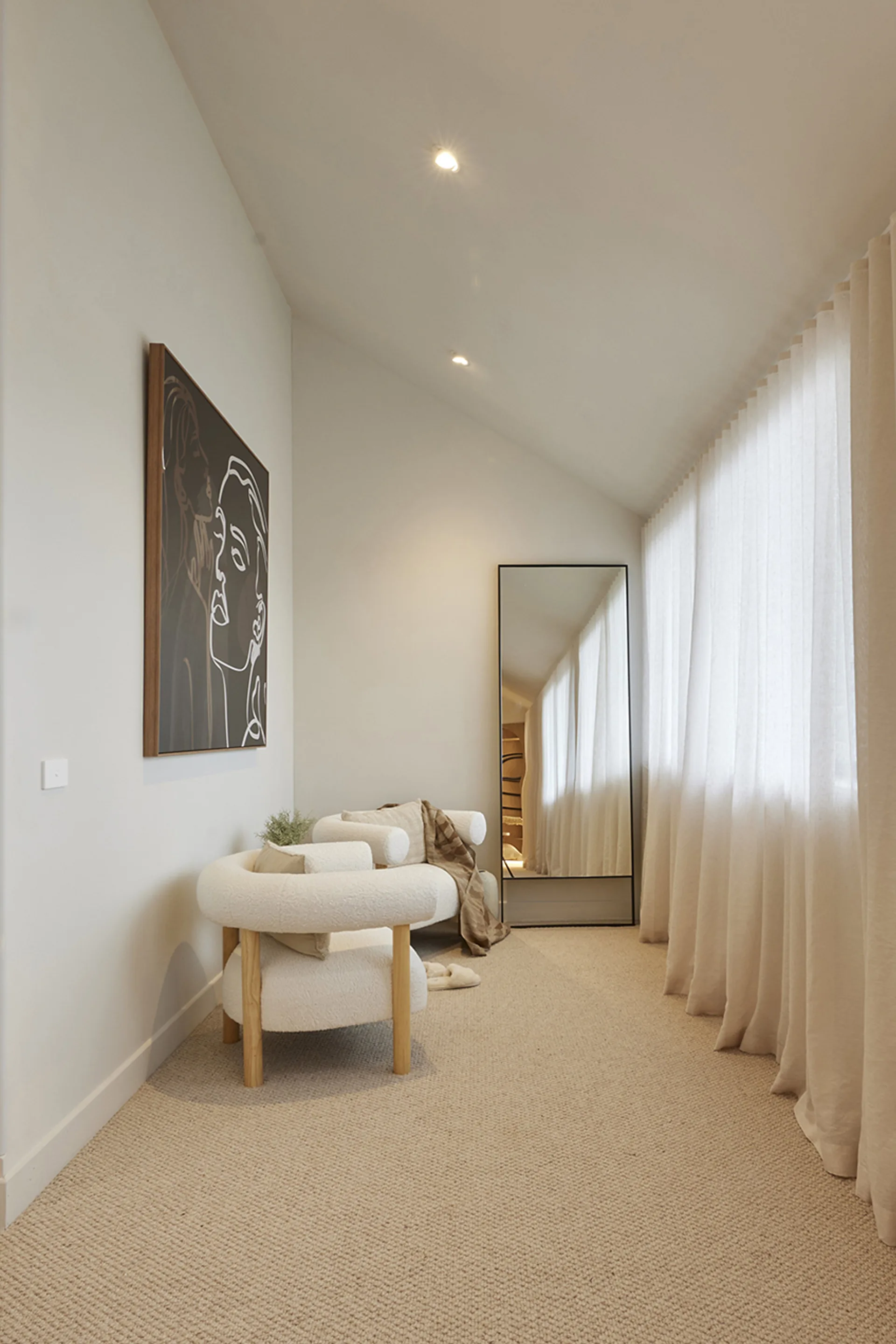
1. For the ‘gram or real life?
All contestants presented picture perfect bedrooms this week (totally Instagram-worthy) but sadly, many were brought undone by their failure to pay attention to practical details.
The positioning of power points, the inclusion of teensy bedside tables with zero storage and sitting areas that were just plain uncomfortable or with a view of … a white wall, were some of the pinch points the judges identified this week. “They need to think about what is liveable, and not what about is Instagrammable, it’s as simple as that,” said Marty.
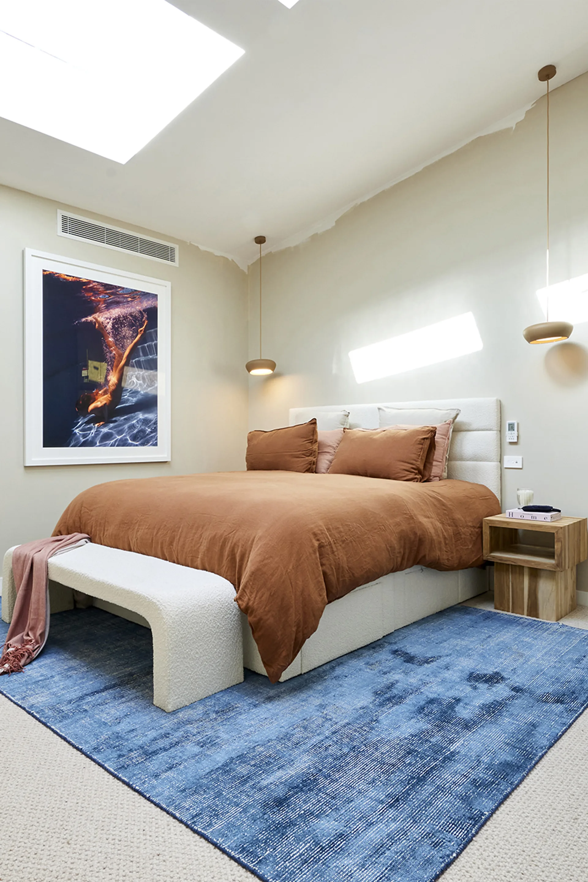
Do this instead: When designing a bedroom, it’s important to ensure that both the beautiful and practical elements are in harmony. If you’re setting up a reading nook in the corner of the room, for example, make sure there’s a lamp to illuminate a book’s pages. Do your bedside tables collect clutter? Invest in generous bedside tables with plenty of storage.
Use beautiful decor and furnishings to hide (or, at the very least, draw the eye away from) the room’s ‘ugly’ yet necessary features. Powerpoints, for example, can be hidden behind a large bedhead or behind bedside tables.
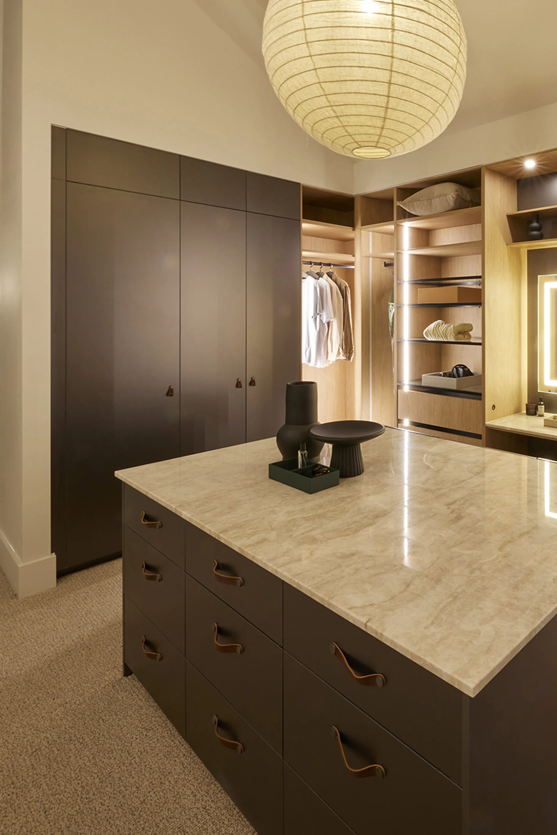
2. Walk-in-wardrobe woes
While any mere mortal would be grateful to have a walk-in wardrobe in their home regardless of its size, this week the judges slammed the contestants for creating walk-ins that were too small.
The judges felt pinched by narrow walk ins which felt even smaller when wardrobe doors were open. An “opressive” and “dated” colour scheme compounded feelings of claustrophobia the judges felt upon walking into Leah and Ash’s walk-in.
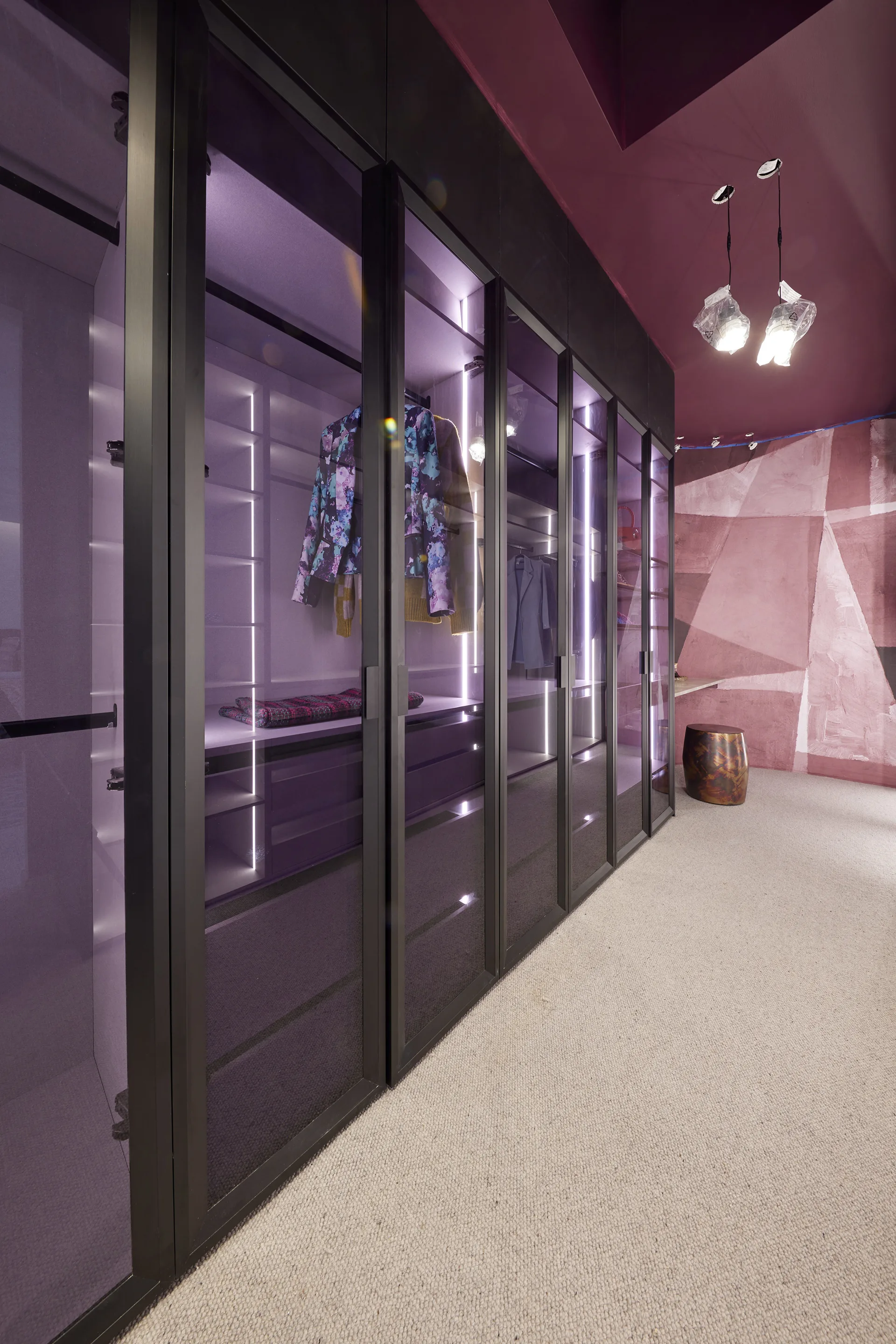
Do this instead: If you’re trying to fit a walk-in wardobe into a narrow space, maximise room by omitting wardrobe doors. Wardrobe doors need room to swing and if two people are trying to get ready at the same time, it can start to feel like a game of cat and mouse. Open shelving may feel slightly less opulent, but is more practical in a compact zone. If doors are a must, go for space-saving sliding doors instead. Also, sticking to a bright and airy colour palette will make the small space feel much larger than it is and is also more practical for dressing and applying makeup.
If, like Steph and Gian, you do ave the space for an opulent walk-in wardrobe – make it as functional and beautiful as possible.
2. Floorplan faults
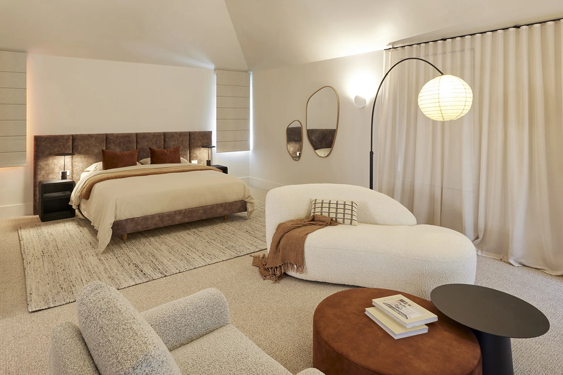
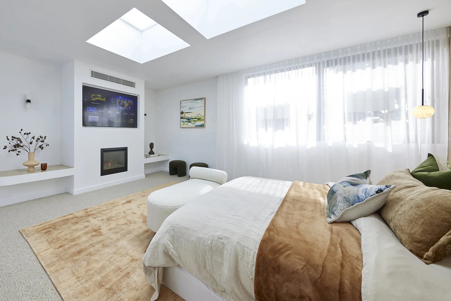
This week the contestants also discovered that a bigger bedroom doesn’t always equal a better bedroom. Kyle and Leslie forfeited a rumpus room to create a larger main bedroom and while the space was beautifully styled, the judges ultimately decided that the extra space was not utilised well enough to justify edits to the floorplan.
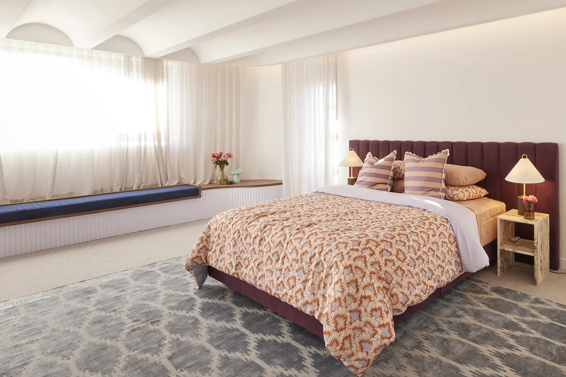
Do this instead: Furnishing a large bedroom can be just as challenging as furnishing a small bedroom. The trick is to slice the room into distinct zones based on function. Of course, there’s the sleeping zone, dominated by the bed, then, if you have the space, you might include a reading nook, and if you have even more space, you may be able to carve out an entire private parents’ retreat decked out with a sofa, television and coffee table.
Be inspired by your own interests as well as the room’s qualities. Other functional sections you can incorporate into a large main bedroom include: yoga zone, home office space or a coffee bar for lazy Sunday mornings in bed.
The judges loved Kristy and Brett’s main bedroom layout which featured distinct zones for sleep, relaxation and entertainment. “This feels like it has just the right floor plan,” said Shaynna. Marty agreed, “It’s so light and airy and warm and cosy, it sort of gives you a big hug, doesn’t it?”