


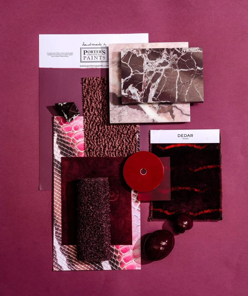
 Photographer: Hannah Blackmore from 'Shaping Spaces' by Claudia Lambert.
If you’re preparing a cosmetic renovation, which interior designer Claudia Lambert calls a ‘space lift’, defining your colour scheme is the place to start. More than just picking paint swatches at your local Bunnings (though, you can definitely still do that!), a colour scheme requires forethought and planning. The goal is to pick tones that not only suit your space and personal style, but also work together in harmony.
A complementary colour scheme is easier said than done. I can personally attest to rushing into projects with a strong idea in mind, only to realise it doesn’t quite work when put into practice.
In her design book, Shaping Spaces, Claudia shows how elements like art, furniture, sculpture, colour and materiality can work together in a home. “It’s my experience in what I have done with clients that has helped elevate their homes, and helped create a very lived-in and thoughtful space that makes them happy,” she shared with Home Beautiful.
Listen to Claudia Lambert on The Edit podcast:
Below, Claudia walks us through four easy steps to build your room colour scheme from the ground up, with actionable and practical ideas to see it through.
How to build your colour scheme, step by step
Before we begin, we recommend setting up a scrapbook, mood board, or a digital document (Canva is a free online photo-editing program, great for digital mood boards), so you can add swatches, colour samples and fabrics to visualise them side-by-side.
Step one: Find your starting colour
The first step is finding “what you’re drawn to”, Claudia says. Interior designers love to use their clients’ wardrobes as inspiration, but we laymen might have more success turning to an app like Pinterest. Start searching and pinning rooms or items you love (dare we suggest the Home Beautiful Pinterest as a jumping off point?), and a theme will emerge.
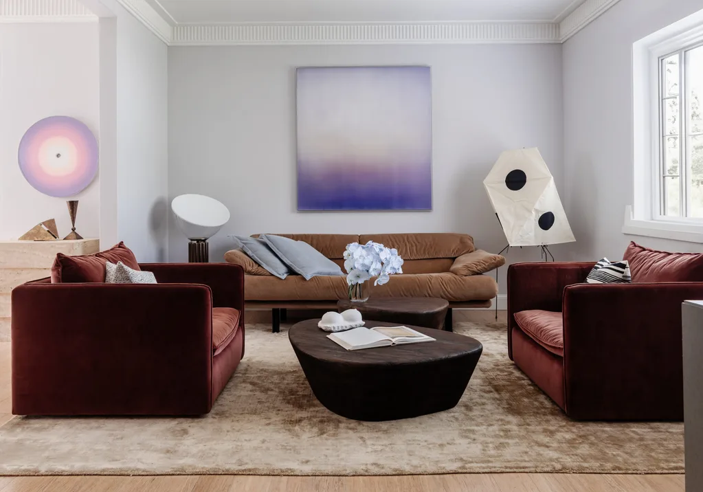
“There will be a common thread that comes through on your feed. Your algorithm will give it to you,” Claudia states. “Is it the colour red? Is it brass? Is it old or new? What is it? What is that common thread?”
Once you’ve found it, it’s time to expand on it.
Step two: Find a balancing colour
The next step is to find a colour that balances your starting point. If your step one returned a bold, rich colour as your key inspiration, you might turn towards a light, complementary tone to strike a balance. Allow Claudia to explain:
“Let’s say [your common thread] is the colour purple. It’s like, ‘Okay, how can I translate that? I don’t want it overwhelming my space, but let’s paint the walls a really soft grey-lilac, so it’s not too in your face, but then we might experiment with a patterned velvet cushion that has a deeper Merlot tone to it, which is a friend of purple.”
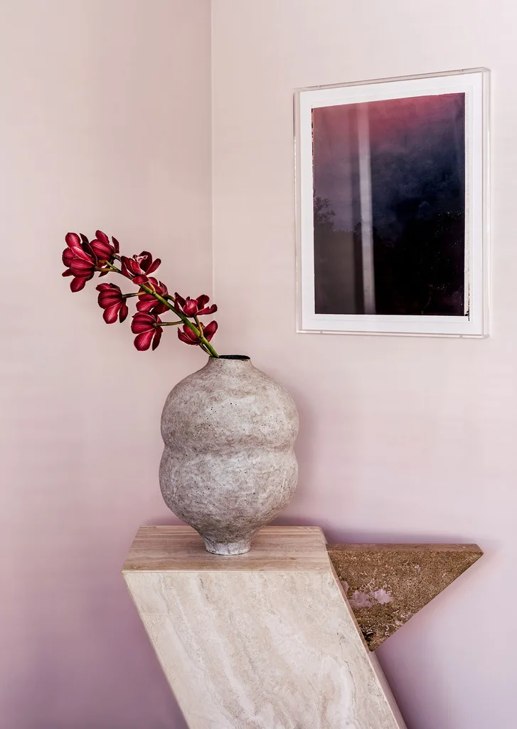
“Then we might look at if we could use a rouge marble here as a little plinth to put something on that plays with those cooler tones but brings some warmth in.”
Step three: Add a texture or pattern
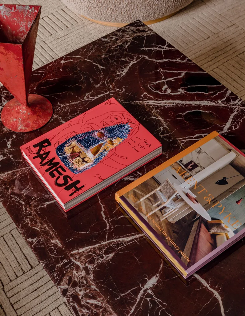
As Claudia suggested with her marble example, find a texture or pattern that’s going to complement your first two colours, and add some depth and interest to your palette. You might look at your flooring or furnishings — which timber, tile or carpet are going to work? It could also simply be a patterned fabric or textured finish that can form some of your decor, like vases, bowls, cushions, rugs, curtains or wallpaper.
Step four: Find your metal
Finally, find which metal is going to work. Metal is difficult to avoid. It will appear somewhere in the space, whether that be door handles, light fixtures or more prominent places.

Using her existing example of lavender, merlot and rouge marble, Claudia poses: “What metal is going to complement that lavender and merlot? Is it going to be a bronze? Not a bright brass. Not a ’70s chrome. Could it be a bronze? Sophisticated muted but still has a strong presence?”
Then consider how you plan to use this metal in your space. Claudia offers these questions to ponder: “Is it through a lamp base? Is it through changing my front door handle? Is it having a pendant light that has a brass element to it but then a beautiful silk shade?”
Once you have your main colour, complementary colour, texture and metal, you can continue to add any other fabrics and finishes that aren’t currently there. (Remember: flooring, window coverings or ceiling colours, which could significantly sway the colour of your room.) Place it all together visually via mood board and see your vision come to life.
One final say:
As Claudia concludes, the trick is in finding balance and harmony within your space. There may only be one way to do this for sure: hire a professional. However, if you’re doing it yourself, don’t ever skip making a mood board to ensure your vision is going to go to plan.
“All these things are easy for me to come up with but, in a home, it’s about how to introduce them and balance them, and not over-saturate things,” she explains.
Home Beautiful editor Elle Lovelock uses this relationship analogy: “It’s not about having twins. It’s about having cousins, or friends with a common interests.” Your items need to be related by a common theme, but they don’t need to look exactly the same, be from the same range or store, or all be the same colour and finish.
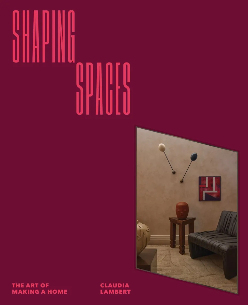
Claudia Lambert’s book, Shaping Spaces, is now available for pre-order at most book retailers.

