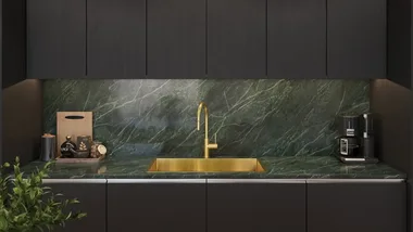
 (Credit: Photography & Styling: Louise Roche)
There’s just something about the homes that grace the pages of an interiors magazine–we’d know. The perfectly plumped cushions, the artfully arranged coffee tables, the effortlessly layered textures and the rooms that somehow manage to look both immaculate and inviting. Then there’s your own living room, and if it’s anything like mine…the cushions are a little flat, the coffee table is collecting clutter, and sometimes the furniture you love just doesn’t quite come together. As it turns out, creating a magazine-worthy home isn’t necessarily about having an enormous decorating budget, expensive furniture or an interior designer on speed dial (although it all helps). It’s about understanding a handful of styling principles that professional decorators use to make a room feel balanced, cohesive and full of character.
The difference between a magazine shoot and a real home
The first thing to understand is that the beautiful rooms you see in magazines have often been carefully styled for the camera. Everything from the position of a chair to the placement of a vase has been considered, sometimes down to the centimetre. But there’s an important distinction between styling a room for a photograph and decorating somewhere people actually live. Interior stylist and former Home Beautiful Style Editor Fiona Gould explains that the principles might be similar, but the approach is quite different.
“Styling a shot for a magazine is all about creating a beautiful photo with maximum impact from one aspect of a room,” she says.
By comparison, decorating a home means considering how each room works together, ensuring the space is functional, practical and suited to the people who live there. And you don’t need to live in a permanent photoshoot to borrow a few tricks from the professionals.
1. Start with the bigger picture
A common decorating mistake is focusing on individual pieces rather than considering how everything works together. A beautiful sofa, a statement armchair and an expensive coffee table might all look wonderful on their own, but that doesn’t necessarily mean they’ll work in the same room.
A cohesive home doesn’t require every room to look identical. Instead, repeating subtle design elements, such as timber finishes, complementary colours or similar textures, can create a natural sense of flow.

2. Learn the art of layering
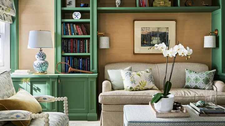
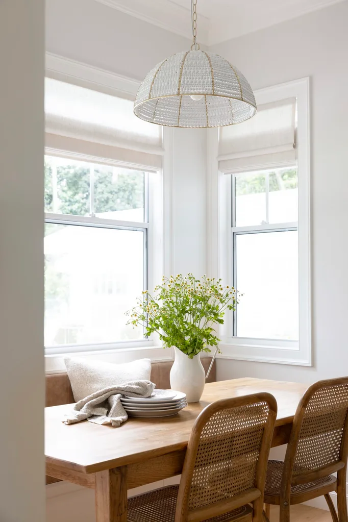
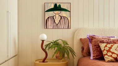
If there’s one thing magazine-worthy interiors tend to have in common, it’s texture. A room filled entirely with smooth, flat surfaces can feel cold or unfinished, even when the furniture itself is beautiful. Layering different materials introduces depth, warmth and visual interest.
Try a linen sofa with velvet and cotton cushions, a wool throw casually draped over the arm and a textured rug underfoot. Add a timber coffee table, a ceramic vase and perhaps a woven basket, and suddenly the room feels much more considered. Stylists say that the secret is contrast. Pair rough with smooth, soft with structured and matte finishes with something a little more reflective.
3. Style in odd numbers
Ever wondered why the objects arranged on a stylist’s coffee table always seem to look better than the ones on yours? There’s a good chance they’re following the rule of three. Professional stylists often group decorative objects in odd numbers, particularly threes and fives, to create arrangements that feel balanced without appearing overly symmetrical. Fiona is a firm believer in the technique.
“I always recommend sticking to an odd number (it just works!), varying the heights and materials, and including a keepsake or vintage item for a personal and unique touch,” she says.
Try arranging three objects of different heights on a coffee table: a stack of books, a small sculptural object and a vase of fresh greenery.
4. Give your furniture room to breathe
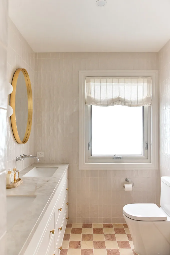
Sometimes the problem isn’t what’s missing from a room, but how much is already in it. Rather than filling every corner with furniture or covering every surface with decorative accessories, professional stylists leave areas intentionally empty. This allows statement pieces to shine and creates a feeling of calm.
Try removing a few accessories from an overcrowded bookshelf, repositioning an occasional chair or clearing everything from your coffee table before adding back only the pieces you truly love.
5. Pay attention to scale and proportion
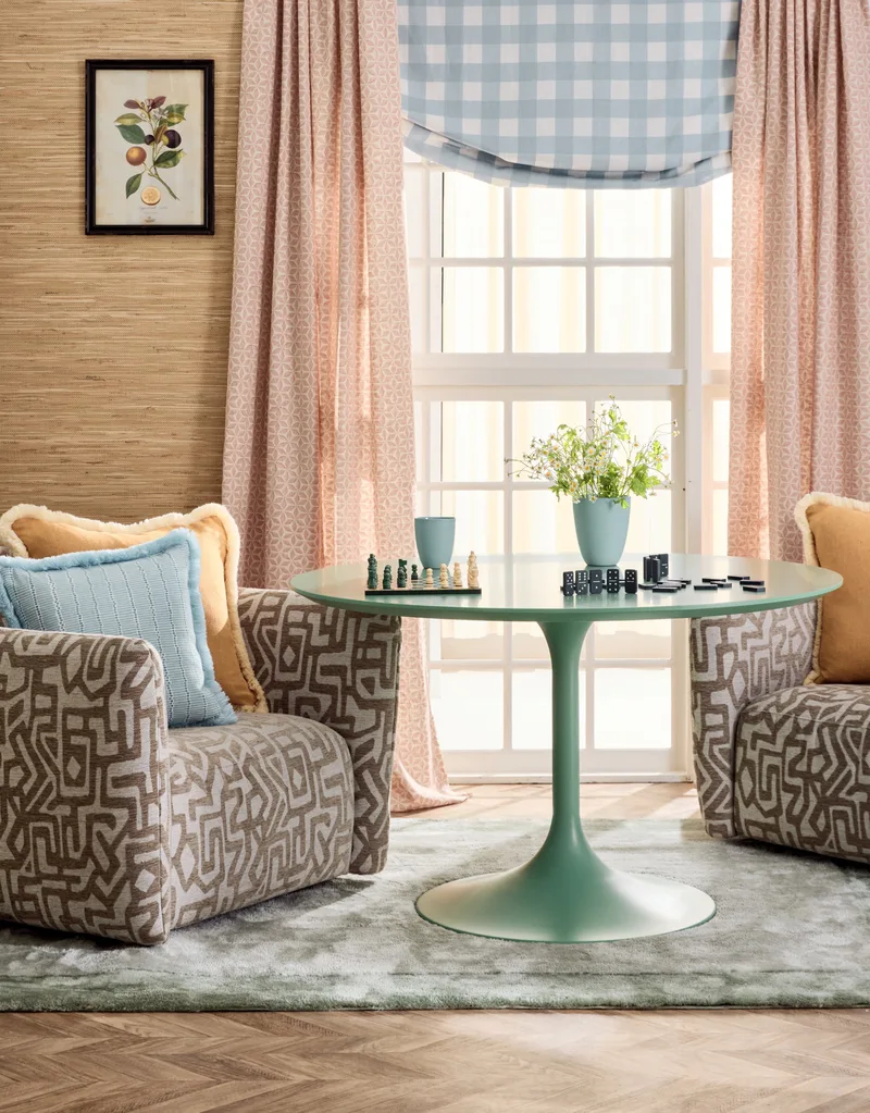
Another reason a room can feel slightly ‘off’ is that the furniture and accessories aren’t quite the right size for the space. A tiny piece of artwork above an oversized sofa, a small rug floating beneath a large lounge setting or a collection of miniature accessories on a substantial coffee table can make even a beautifully furnished room feel unbalanced.
Professional stylists pay close attention to proportion. For example, a living room rug will often look more generous and cohesive when it’s large enough to sit beneath at least the front legs of the main furniture pieces. Similarly, artwork above a sofa generally looks more connected to the furniture when it occupies a substantial portion of the wall space rather than appearing as a small, isolated feature.
The real secret to a magazine-worthy home
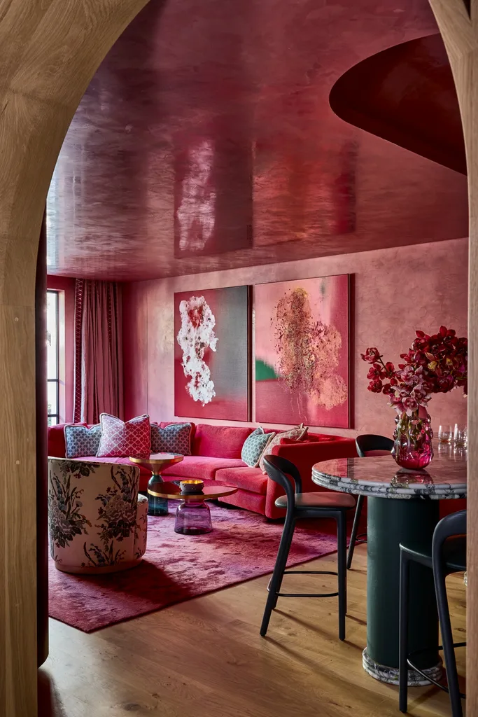
The truth is, even the most beautiful homes featured in magazines aren’t perfectly styled every moment of the day. There are school bags, laundry baskets, half-finished cups of tea and all the other little signs of everyday life that don’t necessarily make it into the final photographs.
What makes these spaces inspiring isn’t their perfection, but the considered choices behind them. So, rather than trying to recreate an entire magazine spread, start small. Restyle a bookshelf, rearrange your furniture, introduce a little texture or finally hang that piece of artwork you’ve been meaning to put up. A magazine-worthy home isn’t really about creating somewhere that looks beautiful in a photograph.


Related stories
Native ad body.

Native ad body.


Native ad body.