 Photography: Simon Shiff
Colour has been cancelled. Pantone is click-baiting us. The Colour of the Year is… an absence of colour?
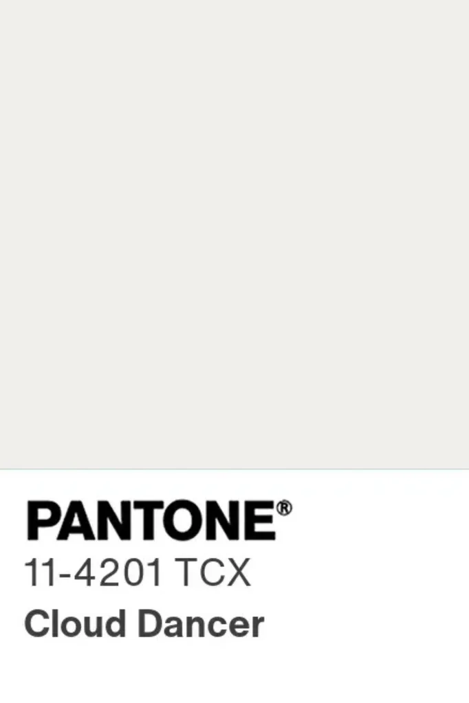
These were just some of the entirely reasonable reactions when Pantone announced its Colour of the Year for 2026 which is – wait for it – white. Yes, Cloud Dancer is officially the ‘hot hue’ of the year and honestly… what the fluff?
It’s not as if Pantone’s pick is ever universally adored. Much like New Year’s Eve itself, the build-up is so hyped that the reveal each December is almost destined to divide the crowd. Still, we’ve had some hits. This year’s Mocha Mousse at least offered some depth, and Peach Fuzz (2024) was silly but strangely irresistible. But white, in this cultural moment? It raised more than a few eyebrows.
Interior designer Jono Fleming’s Instagram comments were particularly savage, with followers pitching alternative names ranging from “Ivory Tower” to “Privilege Pale”. Too harsh? Maybe. But it does capture the collective eyebrow raise.
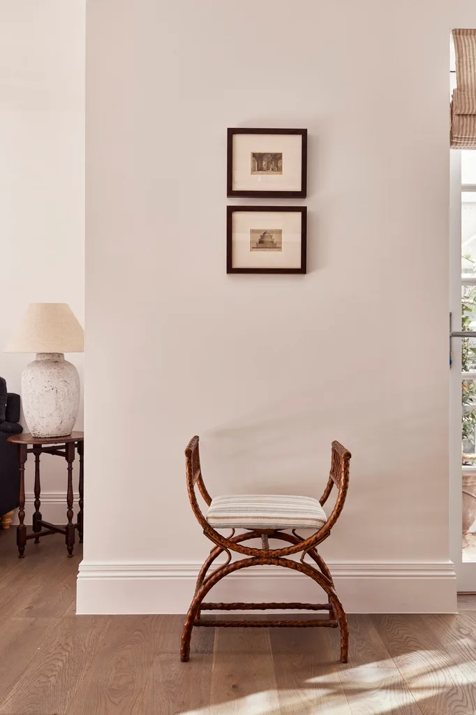
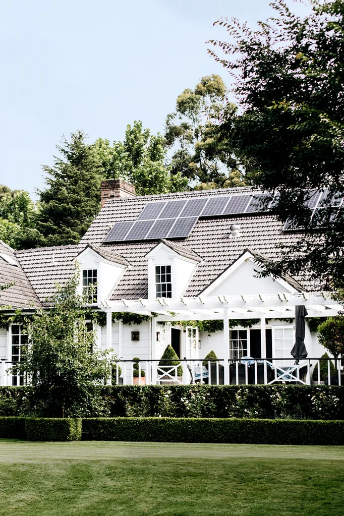
Of course, others have taken a more optimistic view – seeing Cloud Dancer as a clean slate, a reset, a literal blank canvas. And when it comes to interiors, white is hardly a trend, it’s a constant. A classic. The quiet overachiever that never really goes out.
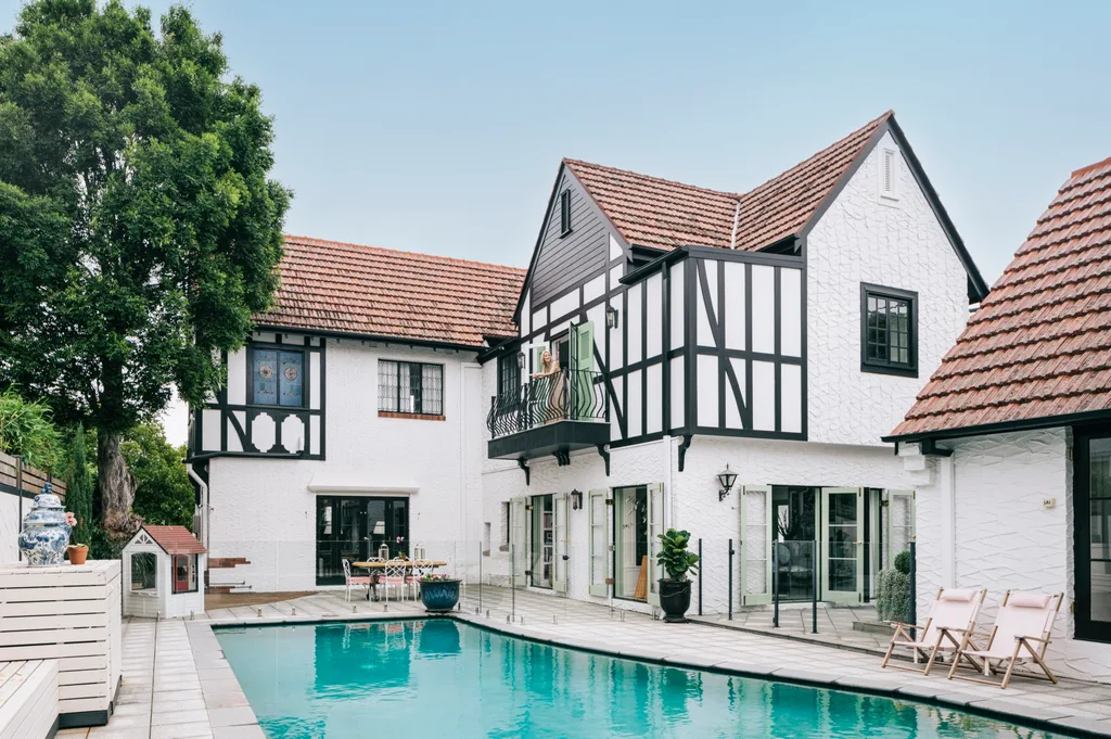
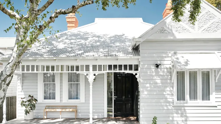
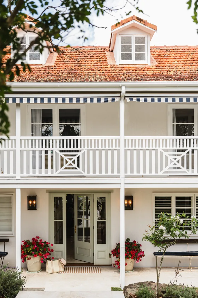
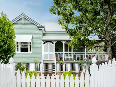
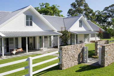
Still, it’s interesting timing. As we head into 2026, many designers are doubling down on colour drenching, saturated rooms and earthy, enveloping tones. But even the boldest among them will admit there’s always a place for a good white. Some might even say that white exteriors are superior. It’s the unspoken staple, the baseline, the anchor.
So yes – the Pantone Colour of the Year might feel anticlimactic. It may be a bit ‘blah’ for those craving something punchier. But ask any designer for their most-reached-for paint colours and you can bet there’ll be a curated lineup of whites in the mix.
Best white paint colours for 2026
These are the white paint colours interior designers recommend for the year ahead.
For the closest match to Pantone’s ‘Cloud Dancer’: Dulux White Exchange Quarter
A crisp, airy white that captures Pantone’s 2026 pick almost exactly.
For contemporary interiors: Dulux White on White
A crisp, modern white that feels fresh without being clinical.
For heritage homes: Dulux Natural White
Soft and timeless, it balances older architecture with gentle warmth.
For a warm undertone: Resene Ecru White
A welcoming, creamy white that adds subtle cosiness to any room.
For a cool undertone: Dulux Lexicon Half
Bright and energising, perfect for spaces that lean modern or minimal.
For a tried-and-true all-rounder: Dulux Snowy Mountains Half
An interior-designer staple – reliable, adaptable and always flattering.
For warm but still neutral: Dulux White Duck Quarter
Earthy without tipping too beige, ideal for calming, muted schemes.
For a less stark exterior: Dulux Palace Stone
A softened white that plays beautifully with outdoor light.
For an inviting exterior: Dulux Mt Aspiring
Clean, bright and welcoming – your façade’s new best friend.