 Photography: Hannah Puechmarin
First impressions are important. The exterior paint colours of your home are the first thing people see, so if they’re dated or faded, it’ll leave your place looking lacklustre before anyone’s even reached the front door. A fresh lick of paint can make a big difference, but choosing exterior paint colours is not the easiest decision. “There are many considerations you have to make, especially around roofing, gutters, fascia and fencing,” says Andrea Lucena-Orr, colour and communications manager at Dulux.
For a look that’ll last for years, avoid anything that’s already on its way out. “We’re definitely in the no more grey camp, please!” says Melanie Parker, co-founder of interior design studio Ivy + Piper. Read on as our colour experts reveal the new grey and other trending shades, plus how to add these exterior paint colours to your own home.
Exterior paint colours for heritage homes
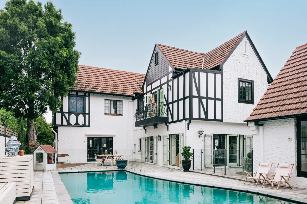
Going with colours you have a fervour for is important, but also consider the style of your home. If it’s a heritage property, certain shades will feel more appropriate. This Tudor Revival-style home in Brisbane was built in the Art Deco era and updated with help from Ivy + Piper. The exterior is painted Dulux Vivid White with striking Dulux Black detailing, which looks authentic with the aesthetic (as Tudor homes have quite a specific look). “A classic white house with black trim never dates, but we like to see some texture added with brick or stone to accentuate the clean colour palette,” says Melanie.
Classics to try
Be informed by your home’s original era and architecture when considering shades for its exterior. A fresh coat of paint in colours that suit its origins could be the best option, rather than diving into the latest hot hue.
Style tips for exterior paint colours
Try unexpected pops of colour
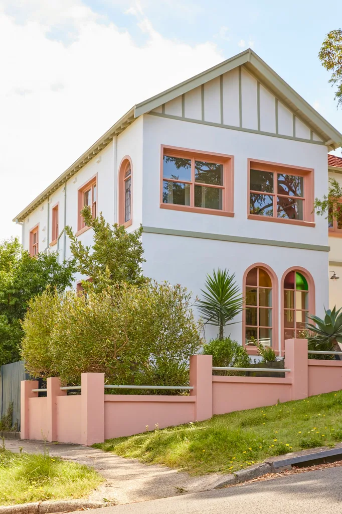
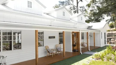
Just like the unexpected red theory that has swept interiors, an unexpected pop of colour on your exterior can be equally stylish and trendy. “We always encourage clients to work with some unexpected colour on the trim and soffits,” says Melanie. This home in Sydney’s Eastern Suburbs is a perfect example, featuring Dulux Piglet on the window trims with a custom green on the fascia (the pitched boards beneath the edge of the roof) and soffits (the underside of the roof overhang).
This up-to-date colour combo has endless possibilities. “A pale pink soffit with a dark green main house colour is unexpected but refreshing,” explains Melanie. “When working with old homes with architectural details, don’t be afraid to paint your deck’s ceiling strapping a contrasting colour or pick a two-toned trim combination for the windows and sills.” Stay open-minded about the possibilities of placing colour in interesting places.
Perfect combination
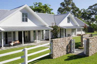
Think outside the box when deciding which elements of your facade to define. Walls are an obvious choice, but fascia, fencing, fretwork, window frames and soffits are others.
Where to add accent colours
Bold and bright front door colours
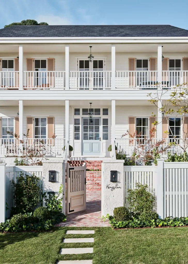
Kate Walker and the KWD team elevated a pink-toned colour palette in this exterior, with shutters in Dulux Recycled which flank the front door in Porter’s Paints Newport Blue. “Most people tend to stick to whites, neutrals or darker charcoals on the windows, fascia and trims outside,” says Andrea. “Doors tend to be more creative, painted in many different colours.” Using a dash of a fun shade on your door or storm shutters can be an easy way to update your facade – and they don’t need to match.
“Front doors are, of course, an easy way to personalise your exterior paint scheme quickly and easily,” agrees Melanie. “Go for bright, glossy shades to accentuate the door’s design and welcome guests in.” If a brazen blue door is too daring for you, opt for a more muted tone that appeals to you. The year ahead is heralding in happy shades of all sorts, from soft lilac to pretty coral and rich plum. The key is to find a splendid paint colour that resonates with you and your style of home.
Popular playful picks
Melanie recommends using a vibrant shade on your front door to energise your home’s facade. For a sense of cohesion, use small doses of the same paint colour elsewhere on your exterior, play with half- or quarter-strengths, or add a complementary hue.
Creating cohesion with exterior paint colours
Timeless yet trendy green exteriors
In recent years, we saw sage green everywhere. Now we’re seeing the full spectrum of this calming colour being used liberally on the facades of homes, from cool mint and warm olive to deep moss. “We love a splash of green on the exterior of a home and it can be accented with contrasting trims in really interesting ways,” explains Melanie. “Our East Toowoomba project features Dulux Remote Control, which can work beautifully on both modern contemporary and traditional homes. Another dark green favourite is Dulux Deep Brunswick Green.” When applied in palatable tones, green can pass as a neutral and is a welcome alternative to grey for Melanie. “We appreciate our lives are far more interesting than grey, and so our homes should be also,” she says.
Greens that are in
If you’re going all in on a gallant shade of green, offset it with crisp white trims and natural details for a look that’s elegant and timeless.
Trendy yet timeless exterior paint colours
Trending neutrals
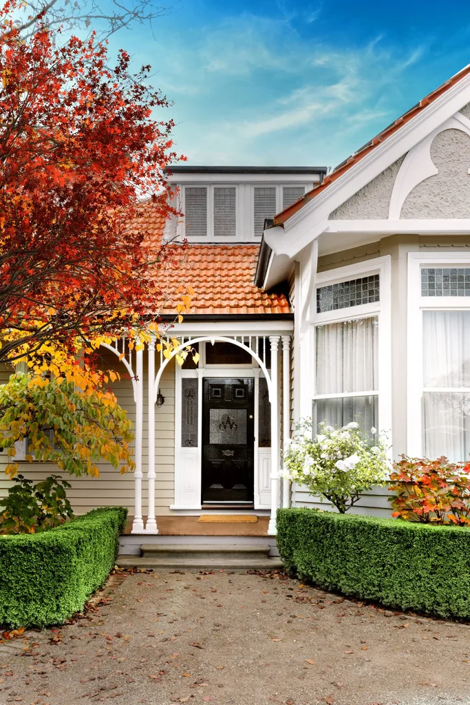
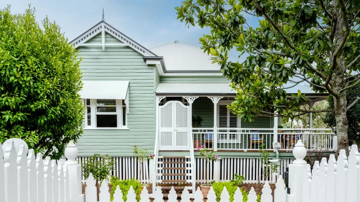
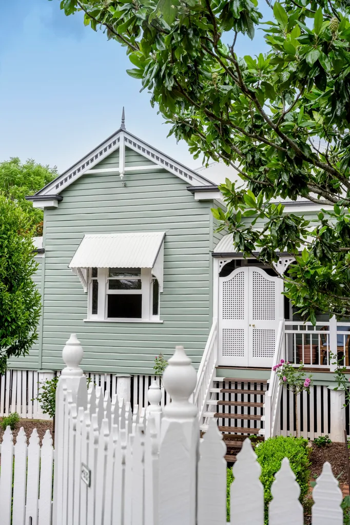
Your comfort zone colours haven’t gone anywhere, they’re just getting warmer. “We’re seeing greys, stone, greige, tans, beige, sand and both warm and cool whites used on exteriors,” explains Andrea. Dulux White Swan adds subtle depth to the weatherboard facade of this heritage home, while Dulux Lexicon Quarter highlights the ornate fretwork and frames the blues and greens in the decorative front door glazing. “As fate would have it, the original leadlight windows at the front of the house included these beautiful tones,” says interior designer Jessica Viscarde of Eclectic Creative. “They provided a stepping stone to explore colour, and the foundation that we built on.”
When designing for clients, Melanie and her Ivy + Piper co-founder, Elizabeth Flekser, are embracing the shift from cool greys towards creams, browns and earthier tones. “We know everyone feels comfortable with grey as it’s so safe, however it’s been drastically overused. Grey should only really be used on trims from here on in!” she shares. “We’re loving cinnamon and ginger shades, such as Resene Crème de la Crème, Porter’s Paints Biscotti or Porter’s Paints Cinnamon Sugar. Great soft whites are Dulux Natural White or Porter’s Paints Bone, which is still fresh yet soft.”
The new beige shades
- Porter’s Paints Cinnamon Sugar
- Porter’s Paints Biscotti
- Resene Creme De La Creme
- Dulux Natural White
- Dulux Lexicon Quarter
Combine timeless and trendy by using a soft yet spicy cinnamon shade on your walls, paired with deep green detailing on external windows or doors, for a facade that feels warm and welcoming.
Warm exterior paint colours