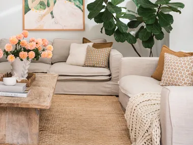
 Photographer: Hannah Puechmarin/ Stylist: Cheryl Carr
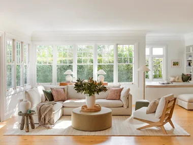
The colour drenching trend is seeing us bid farewell to our plain white walls in exchange for rooms quite literally drenched in colour. Unlike the feature walls of decades past, where one wall took the spotlight, colour drenching sees the all four walls, the ceiling, and often the trim and joinery all coated in the same colour.
“This technique is quite popular as it creates a seamless and cohesive look,” explains British Paints Colour Manager, Shirley Platcher. “Using a single colour can create a sense of spaciousness and calm but at the same time can add a sense of boldness and drama to the space by using deeper, darker colours.”
Tempted to try the monochromatic trend in your own home? Here’s everything you need to know about colour drenching, along with seven colour drenched rooms to inspire.
What rooms suit colour drenching?
Colour drenching can feel like a bold step to take in your interiors but according to Danielle Dunsford of Danielle Victoria Design Studio, it can be done tastefully in almost any room.
“Colour drenching works well in most rooms, but it must align with the house’s style and the clients’ personality,” Danielle explains. “The room’s function and desired mood should guide the choice.”
“Consider the space and what it is used for and the ambience you are trying to achieve.”
Shirley Platcher, British Paints Colour Manager
Colour drenching may be cosily cocooning or a bold statement, depending on room and specific colour used. When identifying a room to colour drench, Shirley recommends, “Keeping in mind the size of the room and the amount of natural light it gets is critical to avoid creating a space that is overwhelming.”
The best colours for colour drenching
Finding the right hue might be the most criticial element of achieving the perfect colour drenched room but it’s often also the most intimidating decision.
“Clients should think about how a colour will make them feel daily, as colour is highly emotive,” advises Danielle. “Natural light, how the space is used, and its connection to surrounding rooms are all key considerations.”
“The best colour depends on the room’s layout—rich, deep colours create intimacy, while softer shades offer calmness. Careful planning of where the colour begins and ends is essential,” Danielle says.
This means that the size of the room is also a big consideration.
“For a smaller room with not much natural light consider using soft muted colours that are calming and create a sense of spaciousness,” advises Shirley. “For bigger rooms with lots of natural light darker deeper colours can add energy to the space and create a warm welcoming atmosphere.”
Expert colour drenching tips
When it comes to colour drenching, the experts have a few tips for getting the look right.
Don’t forget the ceiling
For Danielle, it’s about taking the colour up to the ceiling to “amplify the volume and create sophistication.”
“This brings a dramatic, enveloping effect that elevates the space. We have done this in quite a few projects now, and the result is stunning,” Danielle explains.
Use different sheens
Shirley also recommends using different sheen levels on varying surfaces of the room.
“This can add depth and interest to the space especially when using one colour in the room,” she explains.
Add texture to the space
“When using the same colour, it is important to layer these colours and add texture in the form of accessories to avoid the space looking flat,” Shirley says.
7 rooms that show the power of colour drenching

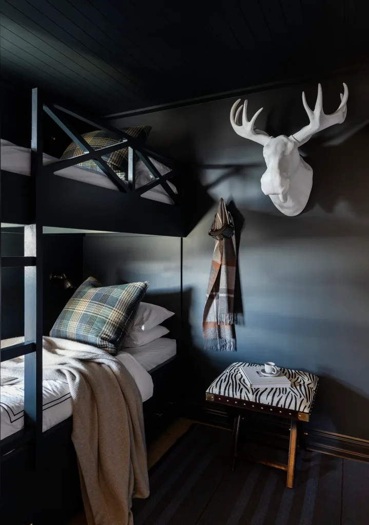
Swathes of grey across the walls, cabinetry and trim turn this room into a magically moody adults-only retreat. The room happens to only be accessed through a secret mirrored door in the main bedroom, adding to the fun.

Colour drenched in a creamy beige, this room demonstrates how to break up the uniformity of colour drenching by using pops of other colours – in this case, bright red dining chairs.

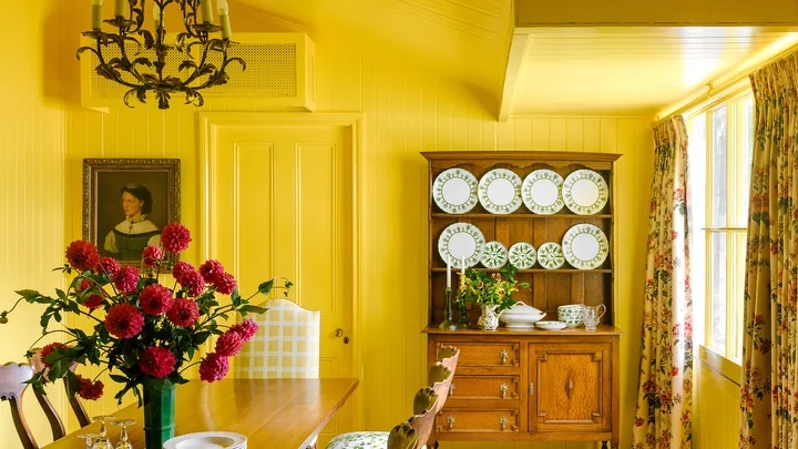
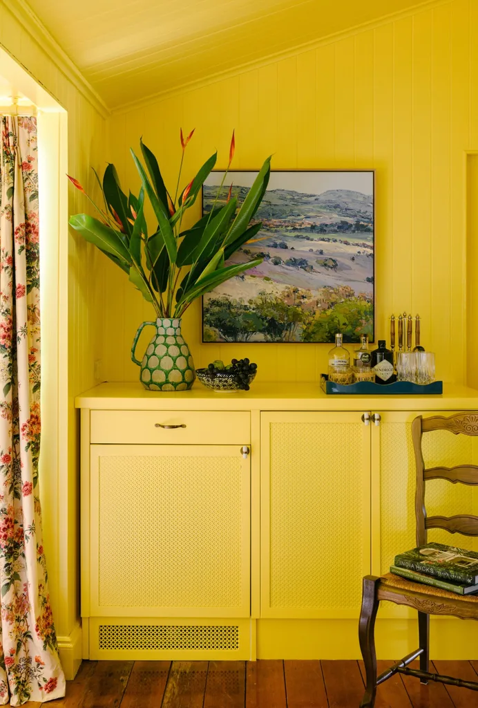
A bold sunshiney yellow coats the walls, ceiling and trim of this playful dining room. The home owners engaged interior designers Melanie Parker and Elizabeth Flekser of Ivy + Piper to reamagine the older property for a young family. The shade is Dulux semi-gloss in Sunburst.
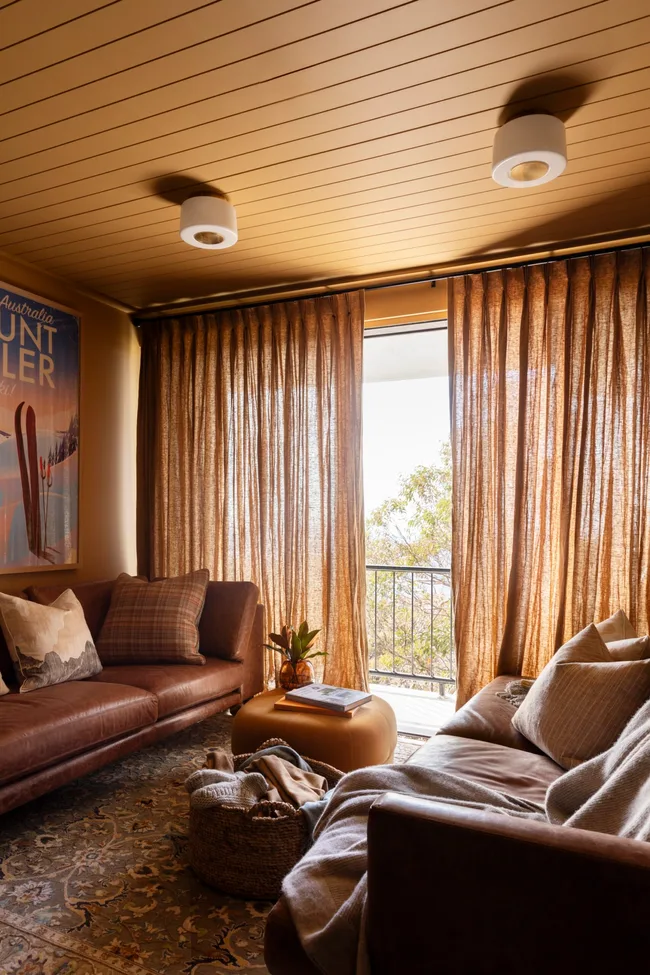
Colour drenching in warm biscuit tones helps this holiday home in the mountains find a stronger sense of cosiness. The walls and ceilings are coated in Porter’s Paints Biscotti tone while the sheer drapes continue the shade, in a different texture.
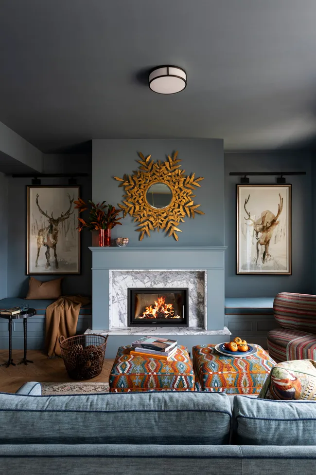
Soft blue creates a cocooning living space
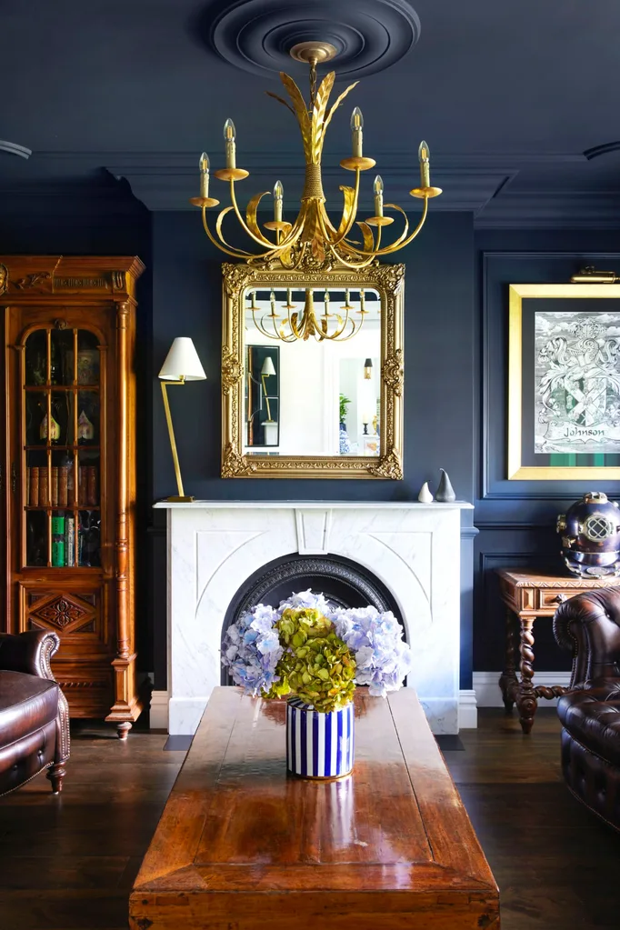
The owners of this holiday home in Mt Buller wanted a boundary-pushing space, with pops of colour and playfulness. “The whole apartment envelops you with colour – sultry blues, inky charcoals, purples, oranges, chartreuse, navy and hot pink,” shares designer, Kate Walker. The result is delightfully contradictory: cocooning yet invigorating, luxurious but ultimately warm and welcoming.

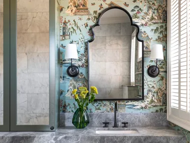
The whimsical Porter’s Paints Water Nymph is splashed across the walls, fireplace and built-in bench seat in this sweet dining room. The pastel shade brings an element of playfulness into what tends to be a traditionally formal space.

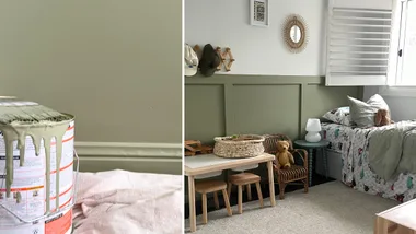
Originally a sunroom, this space has been renamed the green room since being enveloped in one of the home owner’s favourite colours. “We like to do things that are outside of the box, and you should always have something beautiful to look at when you look up,” says interior designer Anna Spiro of the space, colour-blocked in Dulux Apium with Dulux Florence trims.
Related stories
Native ad body.
Native ad body.
Native ad body.