 Photography: Boz Gagovski, Artwork: Artist Unknown
Of all the facets of interior design that have coloured Lisa Burdus’ career, one recurring theme has been colour itself. Even in the early days of her craft, when she worked on the makeover show Domestic Blitz, Lisa rarely had room for white interiors.
Now, as she runs her interior design studio from England and Australia, this core ethos remains.
In this guest-edited handbook, Lisa takes Home Beautiful through her Cotswolds abode and shares the building blocks that support her vibrant scheme so you can do the same. After all, when you decorate with colour, it’s not just the grass that’s greener.
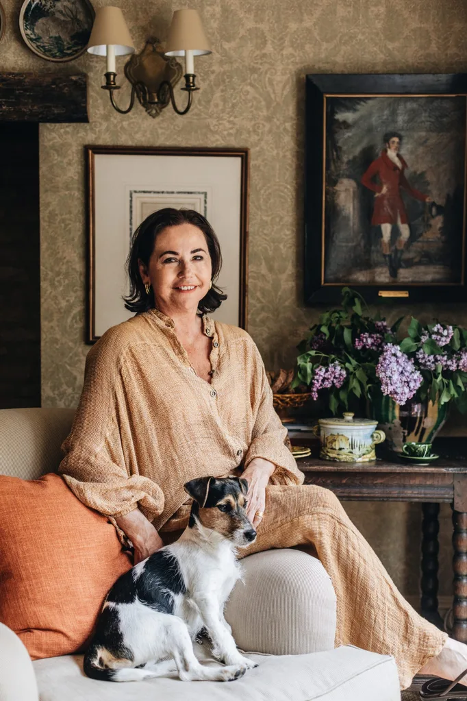
White-on-white interiors may be popular, especially in coastal climates, but it doesn’t matter how hot the weather is – I always feel cold in these spaces.
Considered selections make an incredible difference to a home and how it feels, as long as they’re layered well. For me, design and decoration is all about the end result. Not a perfect photo or curated still life but a living, breathing environment. Put simply, it’s a home that’s designed for life: messy, communal and comfortable.
My current home is in a small village in the Cotswolds in England, a (comparatively) new build surrounded by stone houses and green fields. The summer days are long but not as long as the winters, where cosiness, layers and log fires are needed to create warmth against the batterings of rain and mud. The selections you’ll see on the following pages are earthy – practical to walk on yet soft underfoot – and they work well in warm and cool climates. I hope this palette encourages you to step outside your comfort zone and try something you wouldn’t normally have the confidence for.
And if you’re a colour fanatic like myself, I hope it sparks a red-hot idea.
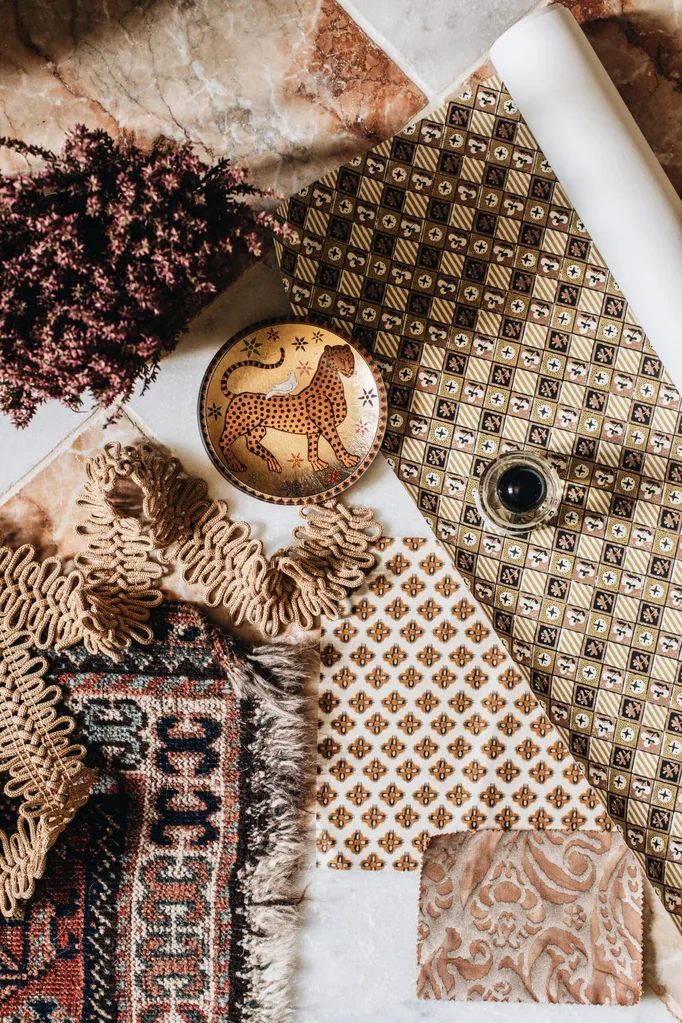
“I love trims. They aren’t essential but to me it’s akin to wearing jewellery. It completes your outfit”
LISA BURDUS
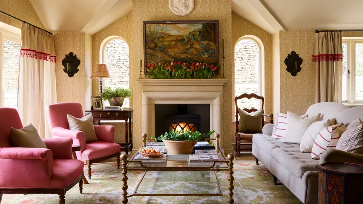
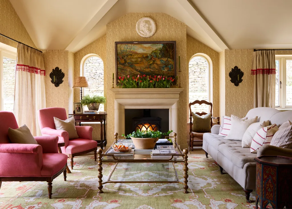
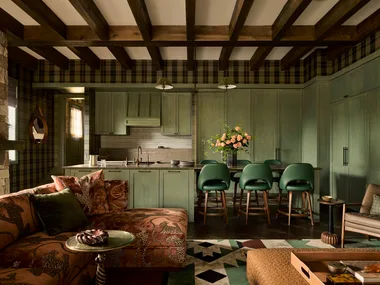
Unlike many of the homes surrounding her abode in the Cotswolds, Lisa’s house is not a heritage build. As such, any sense of maturity she had to create herself. She did this through the architecture, including a part-vaulted ceiling in the open-plan family and dining room, as well as in the rich materials palette.
TOPSY TURVY
When selecting the palette for a home, I always start with a little mental exercise. I imagine tipping the house upside down. The items that don’t fall out, such as flooring, wall surfaces, joinery and light fittings are the selections I start with. These hard surfaces are the anchors of the home – even if the client moves out and takes their furniture with them, the base will still be cohesive, for someone else to have fun with when they arrive. I make surface and colour selections that flow from the front door through the space and ensure repetition in that palette, all the way throughout. It is vital that the hard surfaces blend with the architecture of the home as well as its location and garden. Inside and outside should unite as one. When the garden sings with the interior, you end up with double the space.
CHARACTER BUILD
I grounded all of my hard surfaces (floors, walls and fixtures) with hard-wearing, quality products that made my home feel more solid. This house is not hundreds of years old with stone walls that effortlessly create that characterful feeling. It’s only 40 years old, so I had to retroactively add maturity. I gutted the house and added taller skirting boards, nicer architraves and strong internal doors with good-quality hardware. These small changes make such a difference to how a house feels. Have a close look at all of these items in your home. Could the mouldings be wider or more detailed to add some interest? Could you upgrade your door hardware? It’s worth splurging on essentials that have true impact and presence. You can always save money elsewhere. I like to spend and save as well as mix old and new.
COVER EVERY BASE
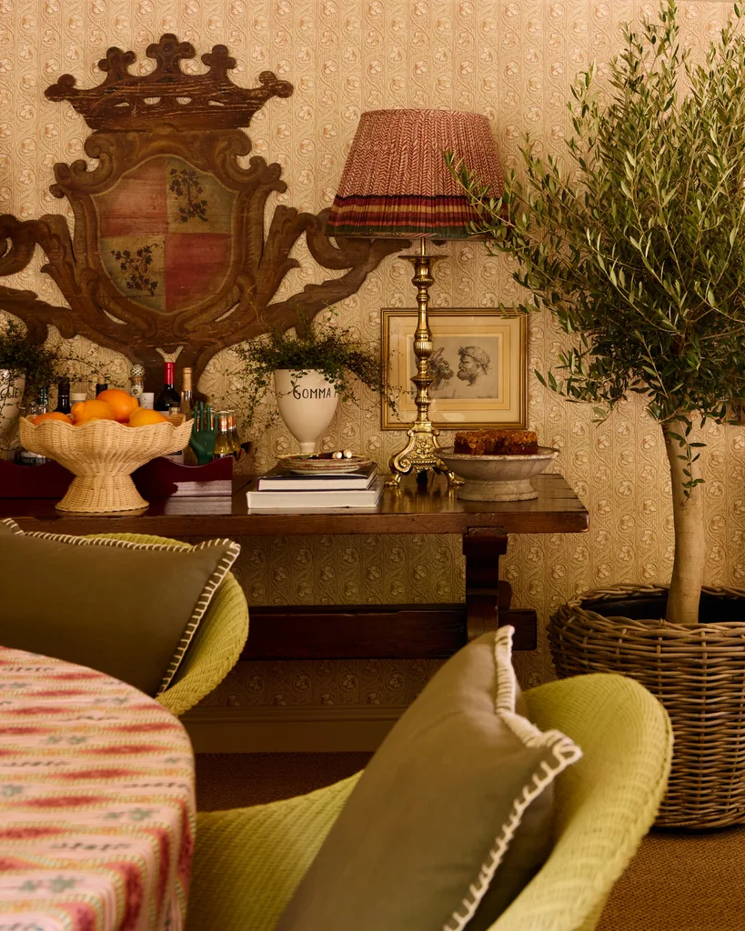
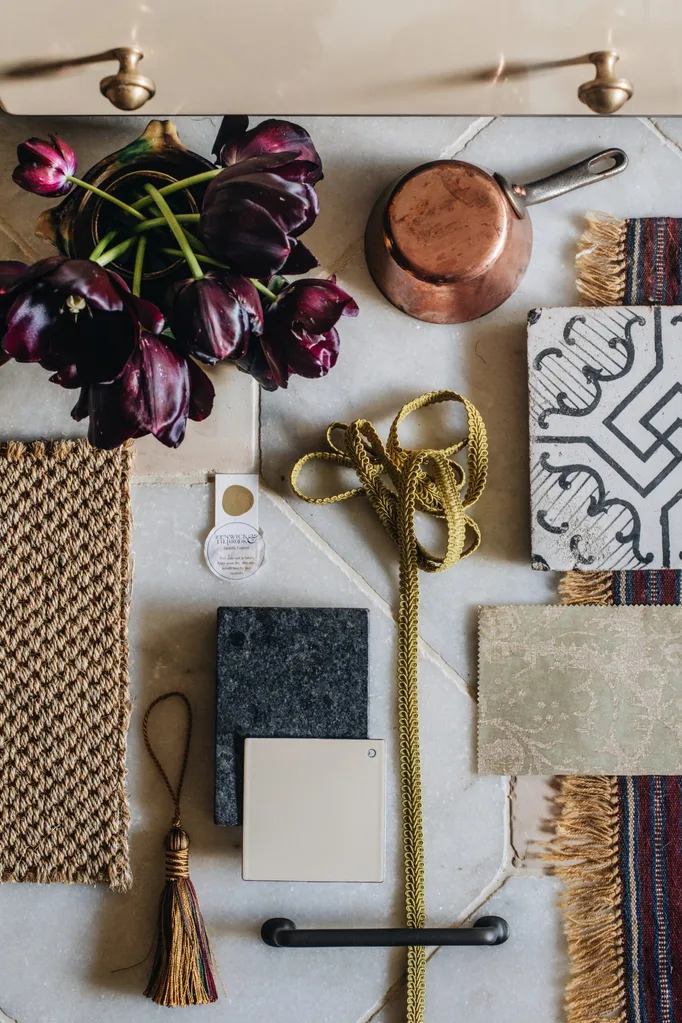
If you keep your base consistent, you’ll have a key complementary layer that you can build upon with playful colour and pattern. In terms of paint, I opted for Farrow & Ball Savage Ground, which appears as both a base coat and the final finish on trims throughout the home. Farrow & Ball is readily available in Australia through specialised suppliers such as Ascraft. Dulux Trade Centres are also able to scan and colour-match Farrow & Ball shades using Dulux paint bases. Similarly, when selecting fabrics and wallpapers, try to ensure the base cloth matches. I’m not saying you can’t ever mix, but if you’ve chosen wild and clashing patterns, you’ll want the base cloth to create cohesion and harmony.
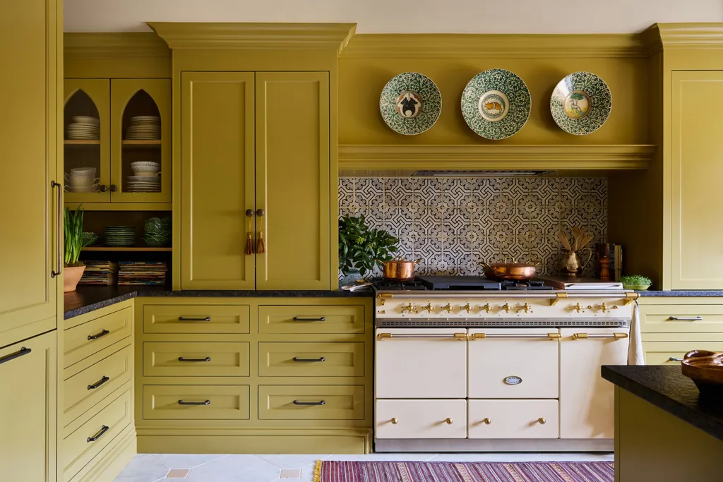
“If you look at the palette, nothing is white. I had to use off-white as a base paint or it would look silly.”
LISA BURDUS
MAKE A STATEMENT
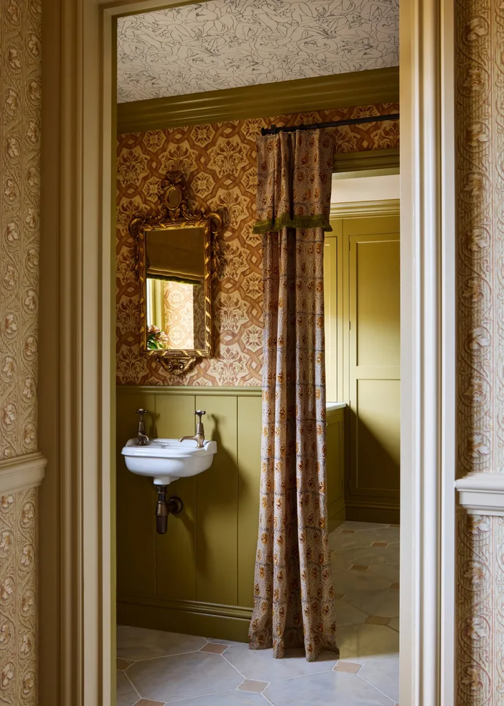
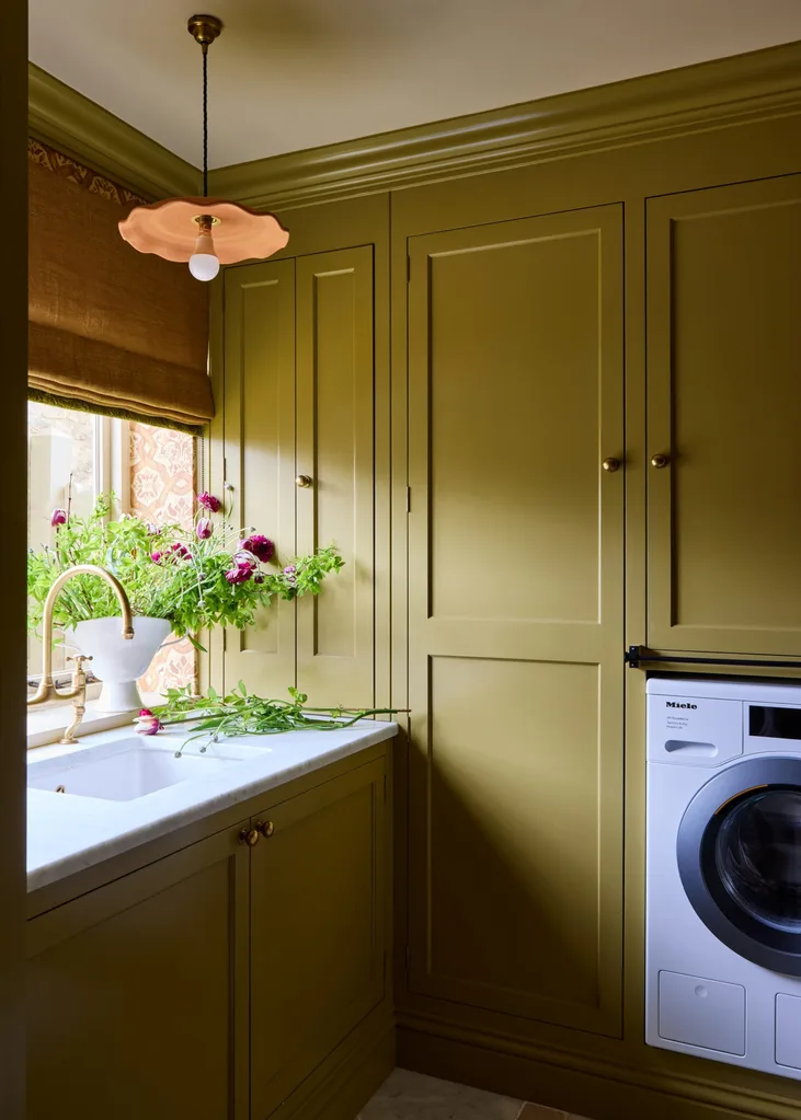
I’ve always been drawn to green. People tend to lean towards blue or green based on how it makes them feel (perhaps it’s some psychological attraction to the countryside or ocean). Chartreuse was a rather bold colour to champion as the hero in this palette, but I decided to be brave and thread it throughout the interiors. For paint, I selected Fenwick & Tilbrook Pimlico Green, which graces the walls in the kitchen, powder room, laundry and upstairs bathroom. Chartreuse is more of a cool-toned green but it also has the warmth of yellow, so it’s versatile as a backdrop. It can be layered with hues such as terracotta, red, pink, purple and aqua blue. In the kitchen, the latter appears in the form of a tiled splashback and decorative dinnerware.
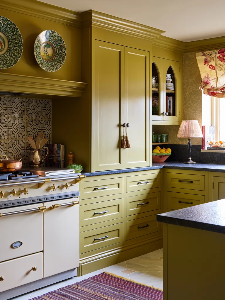
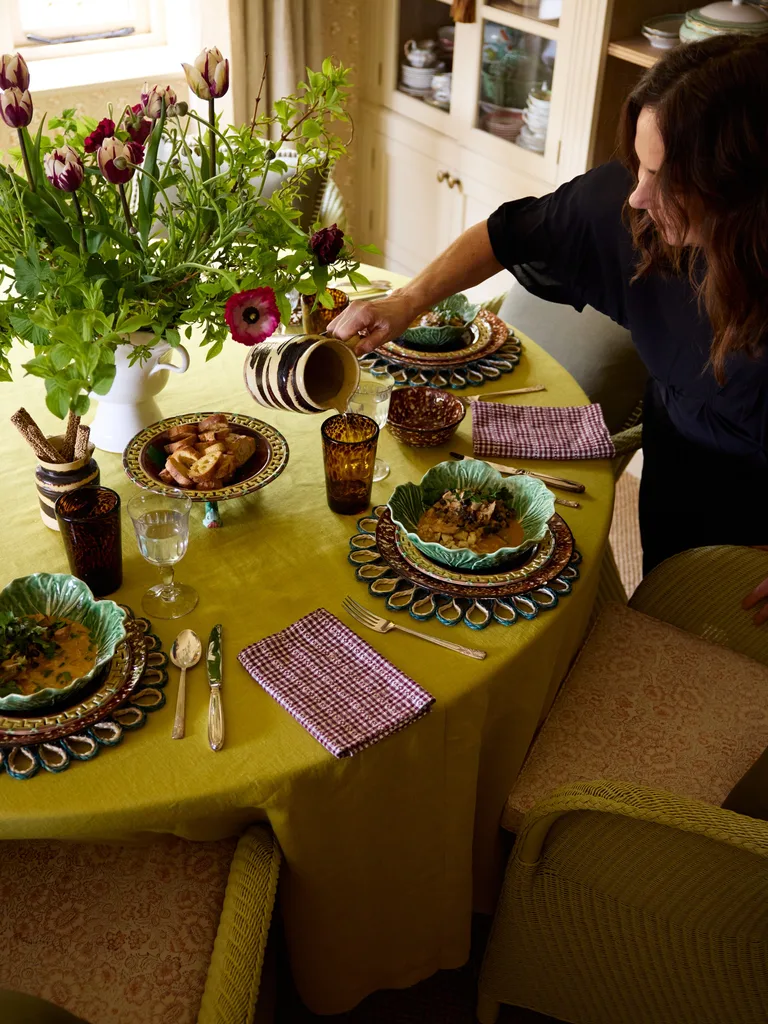
“Nothing needs to be perfect. You can work with what you already have, as long as the pattern and colour is considered.”
LISA BURDUS
ALL TOGETHER NOW
When it comes to building a palette, there is no set formula or ratio of complementary versus contrasting elements to follow. It all depends on the look and feel you are trying to achieve. Once you’ve chosen the hero colour, it’s quite easy to find other hues and patterns that work well but if you don’t trust yourself, you can always turn to the colour wheel and let it guide you in the right direction. A mix of patterns can look incredible if you have three elements all in alignment: colour, base cloth and scale. Aim for complementary hues, matching base cloths and a mix of scales. One large-scale pattern paired with smaller-scale prints works well in a room. Or you could play with one pattern throughout the space in different textures, from your wall coverings to soft furnishings. Once you choose a palette that you like, take note of how natural and artificial light can affect the appearance of colours. If you’re nervous to decorate with bright colour, start with a room largely used at night. The softer lighting is far more forgiving, so you can be a little braver and bolder.
THE TABLE TEST
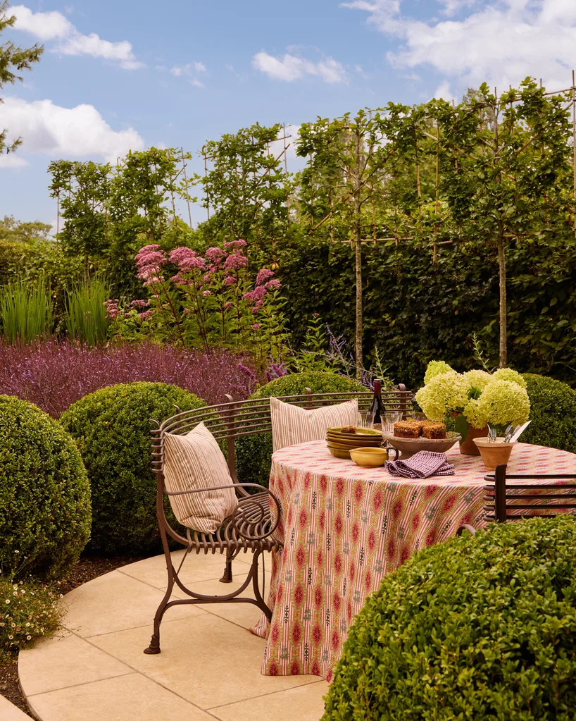
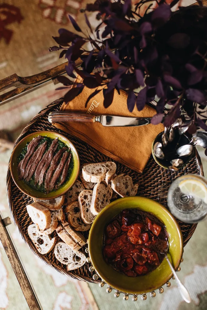
I love creating beautiful tablescapes to entertain around, but these areas also present a unique opportunity. They give you the ability to test out a decorating palette, albeit on a smaller scale. As with the rest of my home, chartreuse is the hero colour that I built this setting around (opposite). I couldn’t find a tablecloth in the shade I wanted, so I bought fabric and cut it to fit (stores such as Spotlight are great for this and it’s very economical). As long as your colour is deeply considered, this makeshift approach will still look elevated. I prefer textured placemats, so I opted for a woven mat with a loopy design, then layered three ceramics atop it – two plates and a cabbageware bowl (for similar, try Williams Sonoma) – in the same reds, greens and browns that complement the chartreuse elsewhere. As always, I’ve combined old and new, as well as bargains beside expensive pieces. I always buy cutlery second-hand (older designs often have a little extra charm). And where I saved with the chartreuse fabric, I splurged on other items. The antique pedestal plate is one example, bought on London’s Portobello Road. The feet are actually shaped like fish and the design is so different it could almost look ugly on its own. But together, with the rest of the palette, it simply works. It’s a good reminder to take chances sometimes.
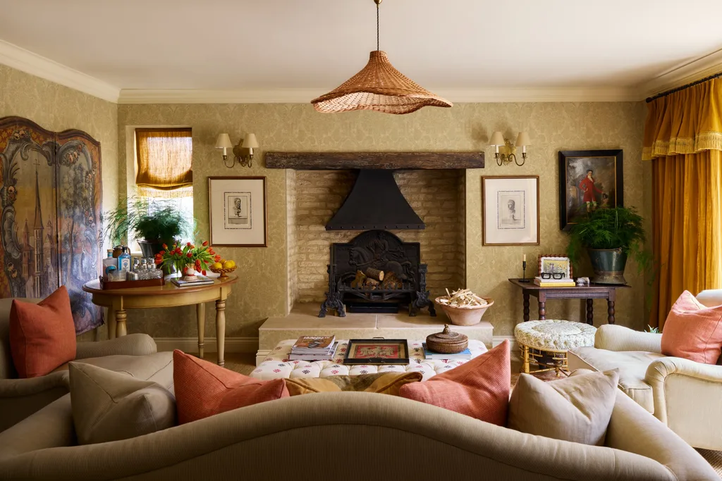
“Some pieces never go out of fashion. It’s all about how you style them through the ages.”
LISA BURDUS
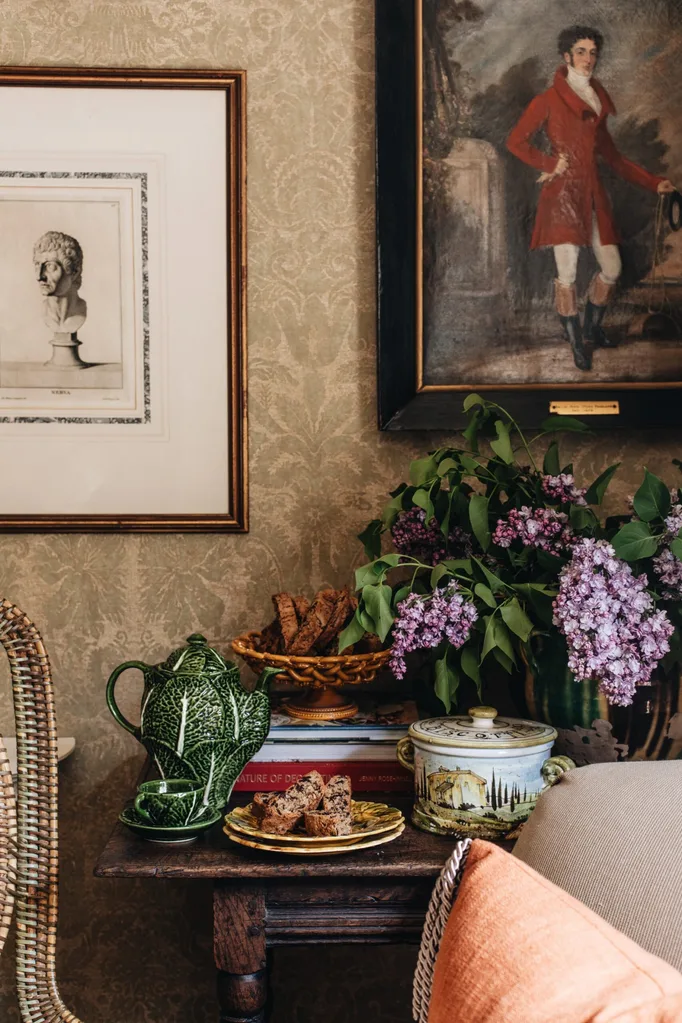
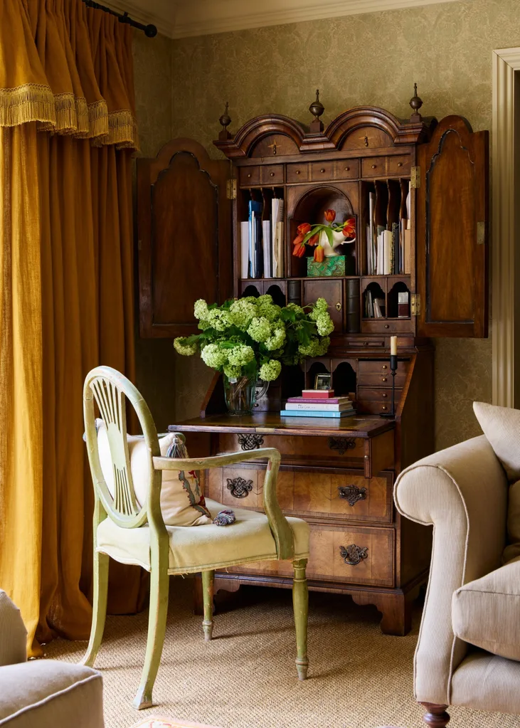
TREASURE HUNT
I don’t always know how I’m going to use a piece before I buy it. But where there’s a will, there’s a way, and if you truly love something, you’ll find a place for it. I bought my antique bureau desk (opposite) at an antiques fair held twice a year on a racecourse in England. It was such an interesting shape, not expensive at all, and has secret drawers that are so well made. As soon as I saw it, it took my breath away. I didn’t know where I’d put it or how I’d get it home, but I had to buy it. You don’t easily find items like it anymore. Not only is it practical for all of my bits and pieces, it also adds character to the newly upholstered furniture. Contrastingly, sometimes you find a piece that serves a clear and perfect purpose. My homemade biscotti is well-known among loved ones and the biscotti tin (this page) that I found in Florence spoke to me.
BALANCE THE SCALES
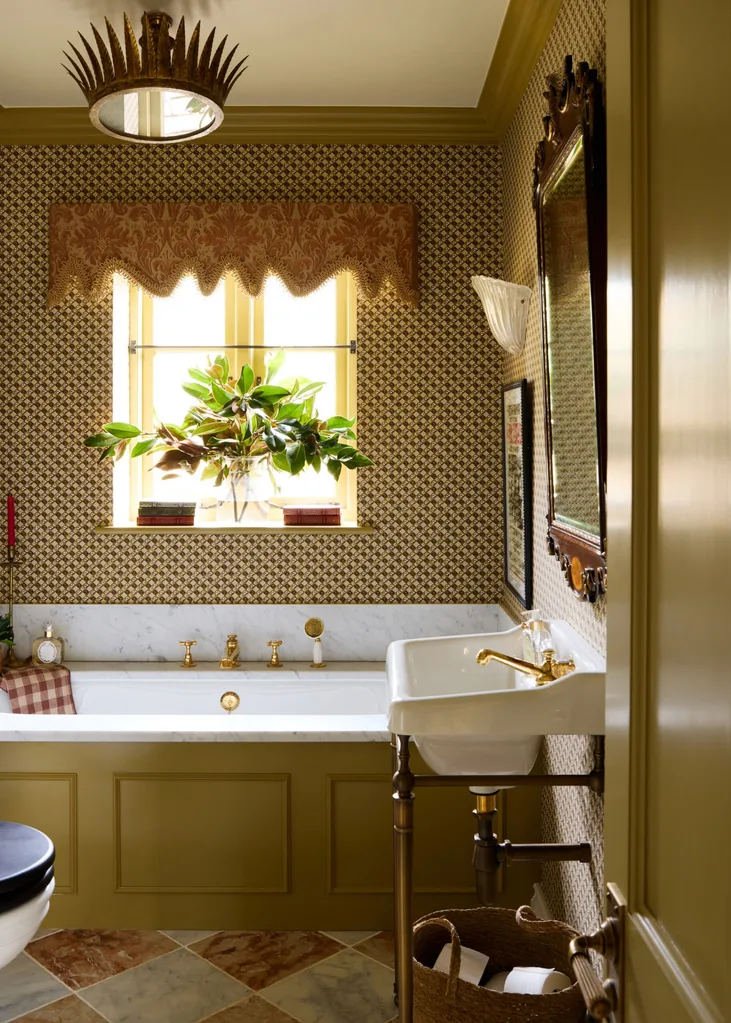
Interior design and decoration is instinctual, but there are little balancing acts you can learn. In every room, you’ll want to repeat colours on a vertical axis. Whatever features on your floor should appear higher up, towards your ceiling. In my family bathroom, I started with the chequered floor tiles then carried their earth-drawn hues up to the pelmet. The next natural step was to introduce my hero colour, chartreuse, so I finished the panelling on the side of the built-in bathtub in Fenwick & Tilbrook Pimlico Green. The room would look off balance if I didn’t incorporate this shade anywhere else on the vertical, so I added it to the windowsill and cornices. Finally, the ‘French Tile’ wallpaper in Olive by Jasper from Michael S Smith has complementary tones and incorporates a small-scale pattern in the space, which works well beside the larger scale patterns in the pelmet, comprised of a Fortuny fabric, and the generous chequered tiles.
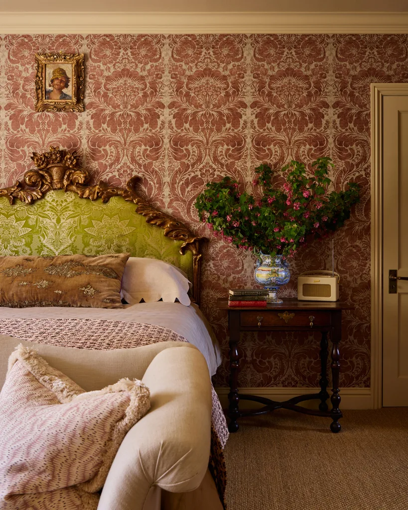
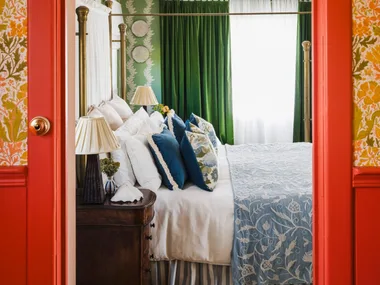
Lisa’s bedroom is a restful retreat, but that doesn’t mean it isn’t bursting with visual interest. The built-in wardrobe features trellis panels and accents of gilded hardware that are repeated through ornate and decorative frames, including the border of the Italian bedhead, reupholstered in a green silk fabric from Lelièvre. It’s a bright pop of contrast against the wallpapered backdrop. The covering of choice is ‘Venetian Damask’ wallpaper in Claret by Patrick Kinmonth for Chelsea Textiles.
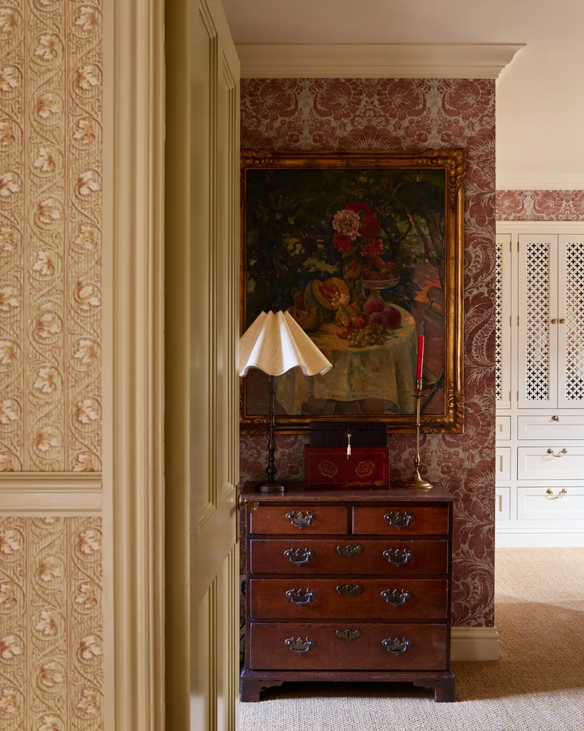
Lisa considered how each space would look when viewed through a doorway. Just as she uses repetition on a vertical axis, she repeats motifs on a horizontal line. The powder room utilises the same Mandarin Stone floor tiles as in the kitchen. The greyscale tones in the marble are mirrored on the ceiling in a monochromatic Pierre Frey ‘Le Couple’ wallpaper. The explicit scene “adds a touch of humour for the guests,” jokes Lisa.

Be the first to read this story by subscribing to Home Beautiful magazine

Related stories

Native ad body.
Native ad body.

Native ad body.