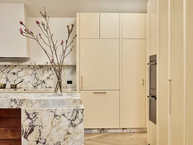
Winter has a funny way of making us notice our homes. The scuffed walls, the room that suddenly feels tired, the living space that no longer feels as cosy as it once did. Fortunately, transforming a room doesn’t always require a major renovation—sometimes, all it takes is a fresh coat of paint.
According to Three Birds Renovations, a fresh coat of paint remains one of the quickest, most affordable ways to make a tired room feel brighter, warmer and more inviting.


While full renovations often require significant budgets and months of planning, painting remains one of the simplest ways to dramatically change the atmosphere of a room over a weekend.
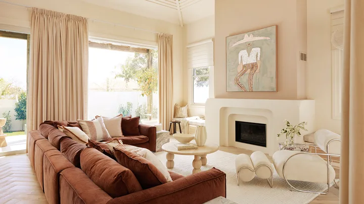
Three Birds Renovations recently partnered with Dulux to prove exactly that, transforming a tired family living room into a warm, layered retreat using nothing more than thoughtful styling and a fresh coat of paint.
“The space had beautiful bones. It featured soaring timber-lined ceilings, generous proportions and plenty of natural light, but years of busy family life had left it feeling cluttered, dated and darker than it needed to be.”
THREE BIRDS RENOVATIONS
Using Dulux Antique White U.S.A.®, the renovation instantly lifted the room while complementing the existing timber ceilings instead of competing with them.


Choosing a neutral palette to define your interior scheme doesn’t mean the look should be boring or bland; in fact, neutrals are about delivering layers and complexity.
“When using colour throughout the home you can create beautiful colour combinations that complement each other, using the natural landscape around you to inspire the palette for interiors,” says Haymes Paint Colour and Concept Manager Wendy Rennie. “We have come to expect more out of homes than ever before as we have navigated uncertain times and our homes need to be everything from an escape to our own sanctuary. Using colours that reflect the environment provides the ultimate in home interiors – it gives the ultimate staycation vibe.”
What are neutral colours?
Neutral colours don’t have to be all white and beige and can range from soft brown hues to pale sage greens with warm undertones. Taking inspiration from nature to focus on colours that work across an entire colour scheme is a great place to start. The key is to select an undertone to suit the mood and effect you’re after in your own home. Warm undertones tend to suit older homes as their scale is often more compact and the decorative architectural features can be beautifully highlighted by neutrals. A more contemporary space with square-set cornices and ceilings is made more dramatic with cooler tones to highlight the vastness of surfaces and seamless transitions.
Are neutral colours on trend?
While palettes using warm neutral colours and green-infused hues feature prominently in interior trends forecasts, texture is the real newcomer with beautiful wall finishes referencing the tactile delights of pearl and crushed stone. “Our desire to connect with nature, within our homes, blurs the line even further between indoors/outdoors as we start to bring traditionally exterior finishes, such as textured walls, inside,” says Wattyl Colour Ambassador Marylou Cafaro.
With neutrals as your base, it’s up to you to inject as much or as little colour into your home as you desire – keeping with the natural tones or contrasting with bolder strokes of colour in furnishings, artwork and decor – even changing with the seasons. “Once you have a few favourite neutral colours for your project in mind, the most important thing is to test your paint so you can see how it will look in your own home,” advises Product Manager at British Paints Carmen Jordan. “Pick up some sample pots, then test them out by painting a large piece of paper and sticking it up on your wall to view at different times of the day and night.”
Take a leaf out of the colour book of our experts and get started.
Home Beautiful Shop: Neutral Decor
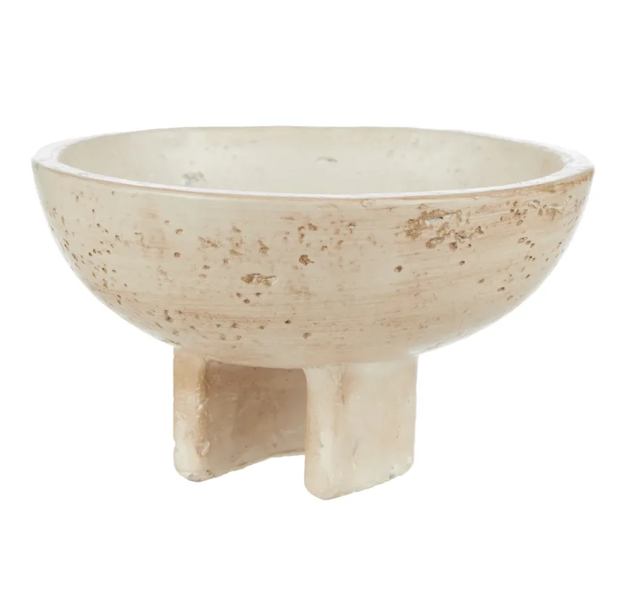
Ingo Cement Footed Decorative Bowl
$27.95- $44.95, Temple & Webster
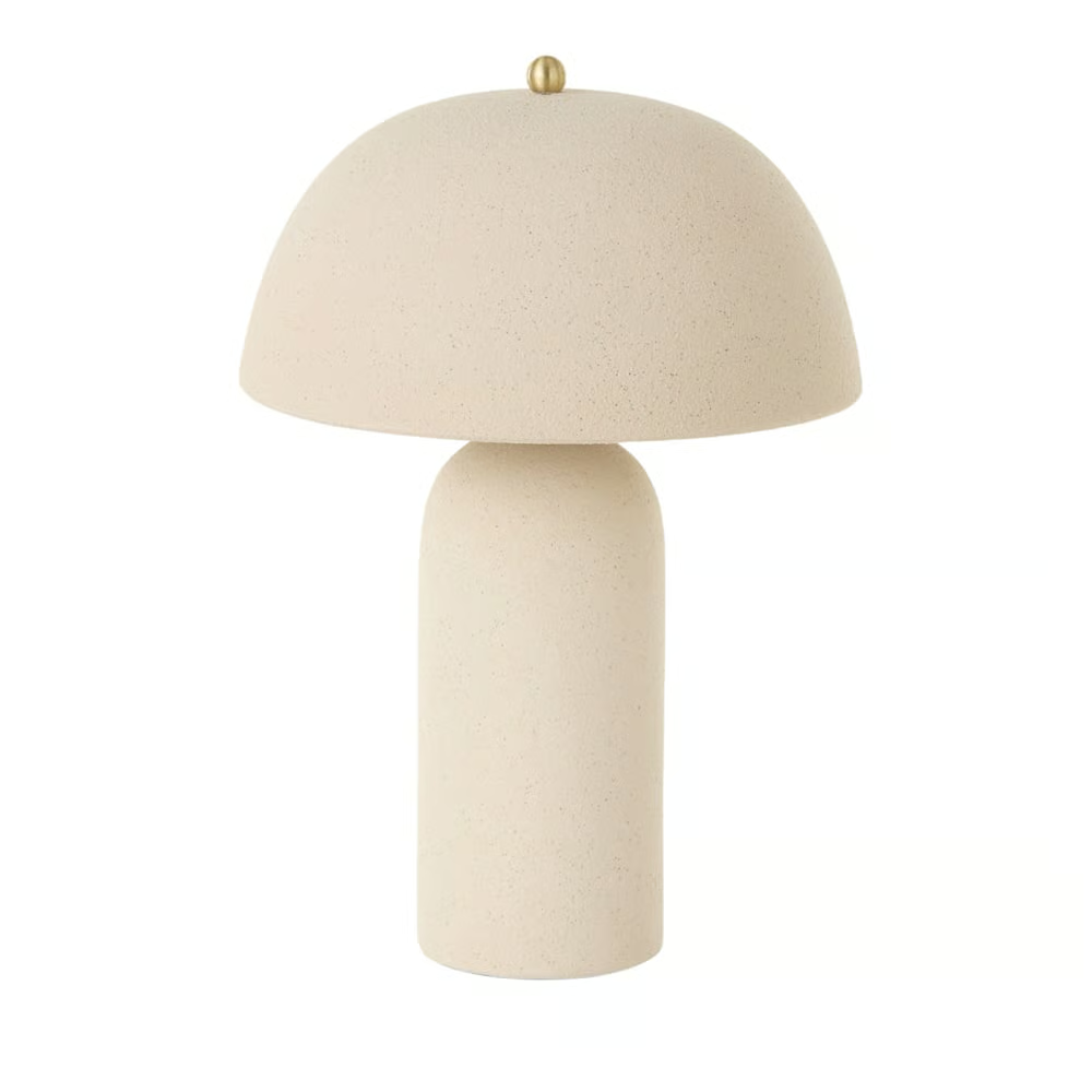
Nora Cream Table Light
$199.99, Adairs
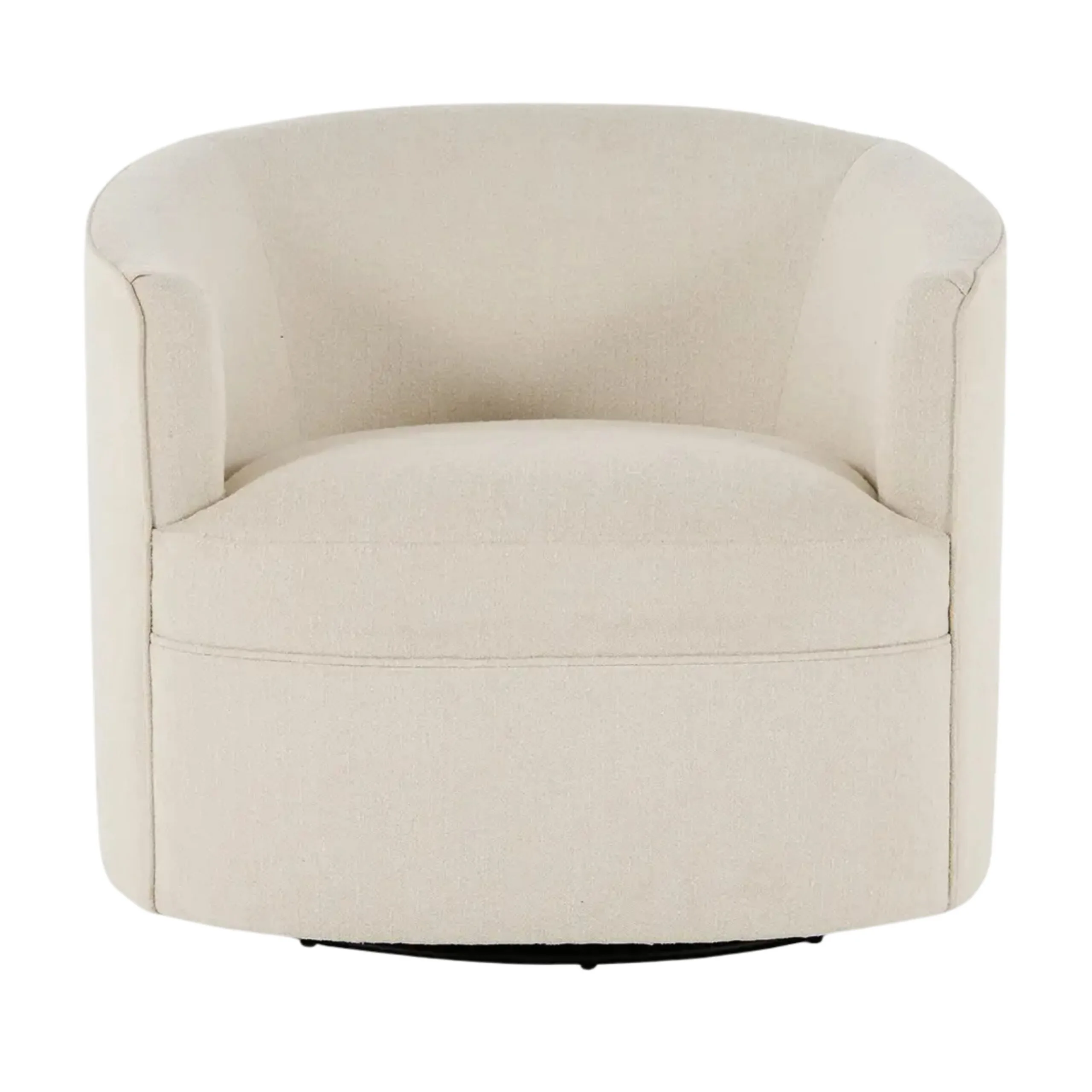
Autumn Accent Swivel Chair$999 $599, Lounge Lovers
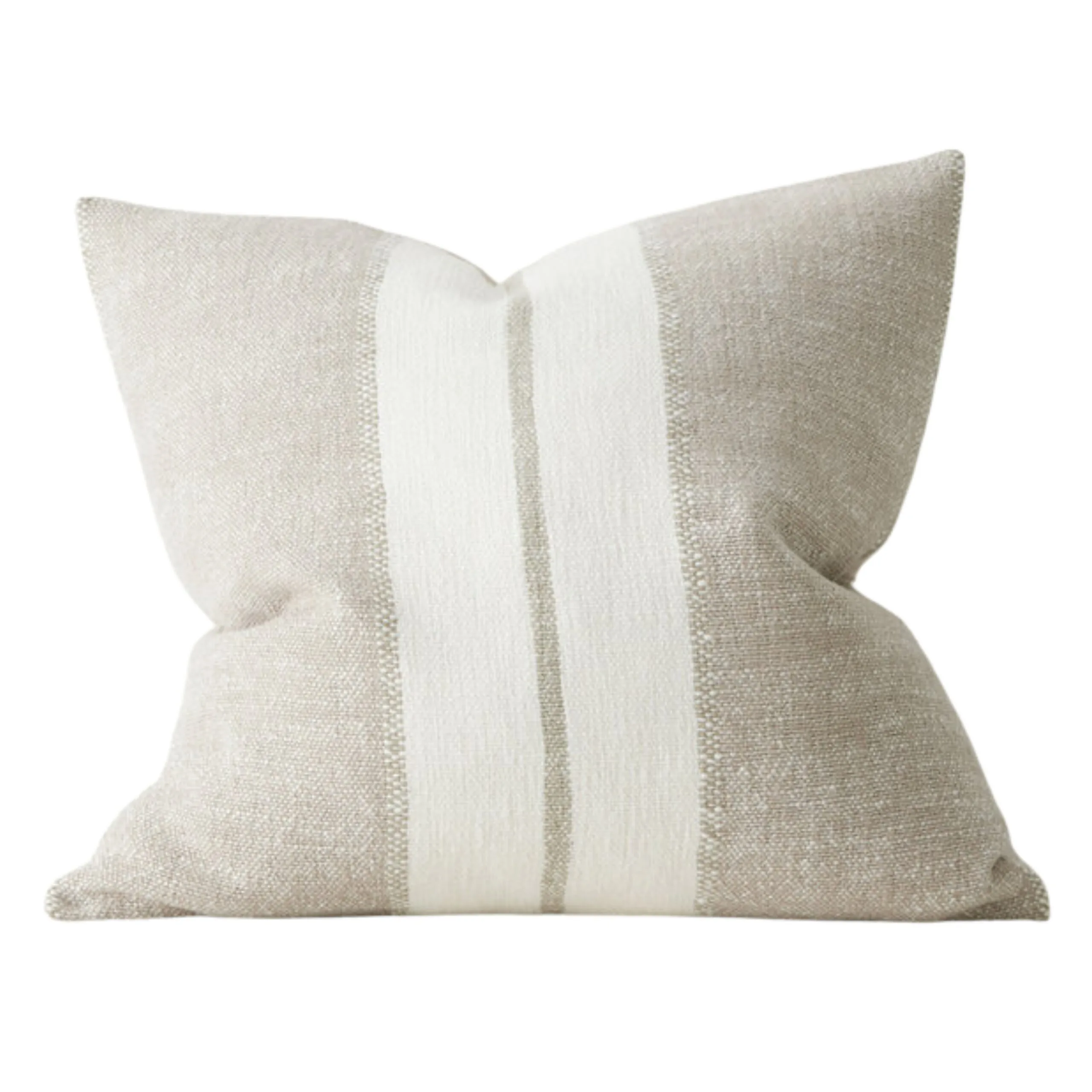
OTTAVIO Cushion$129 $110

Neutrals need not be dull – accents springboard from strong foundations as seen here with walls in Dieskau, table and chairs in Clay Court and ceiling in Terrace White, all Dulux.
Neutral paint colours to choose from
A complex neutral colour scheme
“The Australian landscape gives such a wealth of colours and combinations to choose from,” says Wendy Rennie. “From earthy neutrals to rusty reds and soft greens, to the rich blues and deeper forest greens, combined with sandier warmer tones found at the oceanside and in our bushlands.”
“Try using Woodsmoke on walls, Snow White on the ceiling and Lambswool on trims,” suggests Melanie Stevenson of Porter’s Paints. “Woodsmoke is a complex grey, not a cool grey, that has undertones of yellow, violet and magenta. Lambswool is lighter, a white with a grey tone that teams and balances beautifully with Woodsmoke. Snow White is really an artist’s white. Very crisp and clean.”
For a slightly warmer grey/neutral colour combination, Dulux Colour Expert Andrea Lucena-Orr suggests, “A palette to provide an elegant natural scheme with a slight warmth, however, still creating an adaptable palette that schemes well with many other colours and accessories.” Her choices: Tranquil Retreat, Terrace White and Lexicon® Quarter, all Dulux.

A calm bedroom environment was created with Haymes Paint Quartz on bedroom walls and Bushland in the adjacent open walk in-robe. (Credit: Haymes Paints)
A soft neutral colour scheme
Serene pale blue hues are perfectly balanced with whites, off-whites and soft beige tones to create a sense of simplicity and peace. When paired with subtle, tactile surfaces and textures the ambience is one of calm and relaxation, where we are invited to slow down, pare back and live in the moment.
Light, airy colours take on new meaning and significance when applied in a textured finish such as GranoImpact from Wattyl. The creamy paste-like finish can be applied by roller or spray to achieve a very subtle texture.

A contrasting neutral colour scheme
“Working with similar undertones, these greys (greiges) vary in shade, therefore creating a subtle and soft colour scheme,” advises Andrea Lucena-Orr of Dulux. “If you want to add a contrasting colour Western Myall will work with any of these softer greys.”
Wendy Rennie points to Sense, Marble Mist and Intrigue from the Haymes palette. “The perfect neutrals combination is grey, white and black,” she says. “This combination gives the ideal contrast between light and mid-tone colours to accentuate the features of the space. The black acts as the focal point of the combination, adding statement and punch to the overall scheme.”
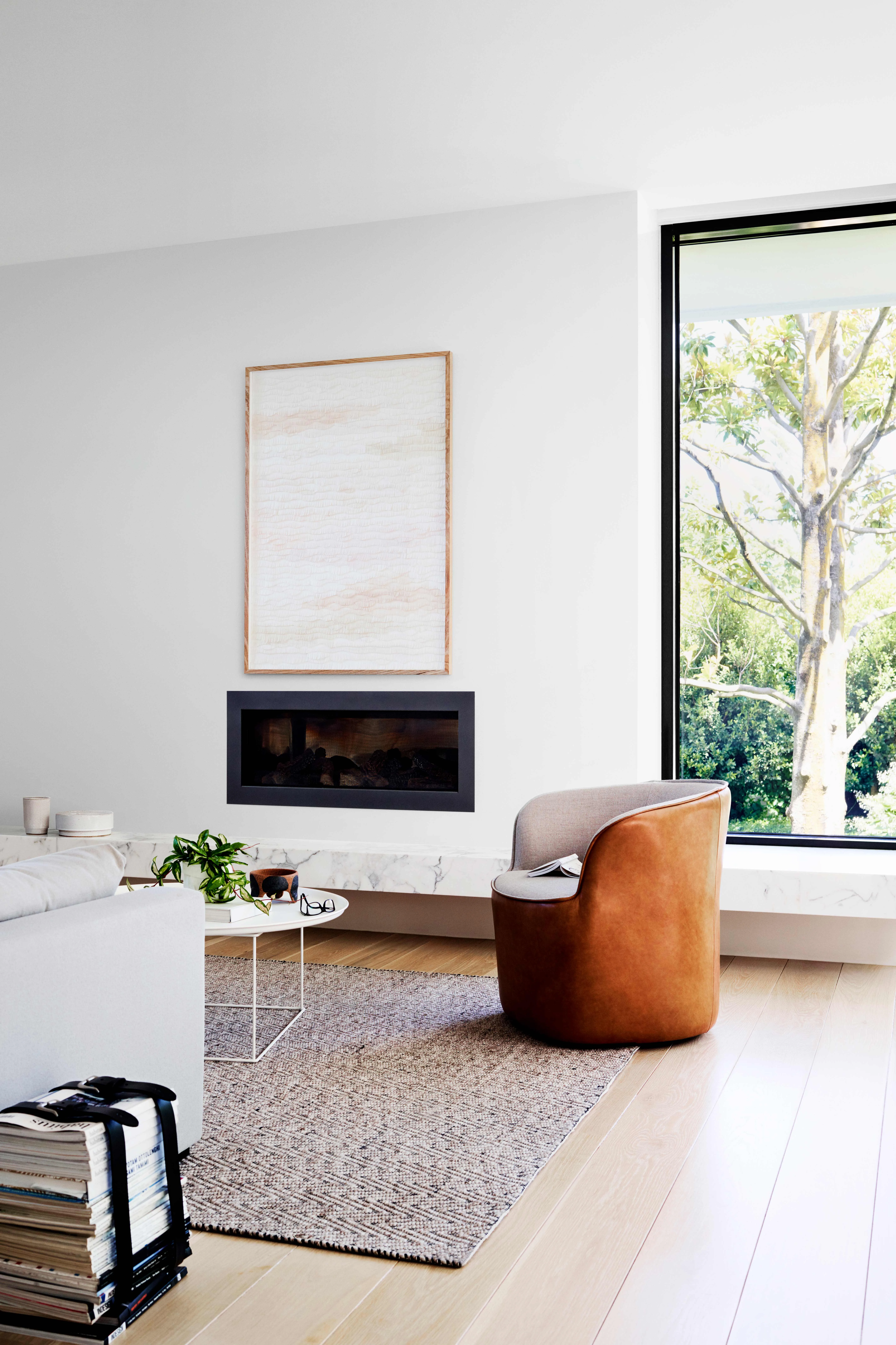
“By combining neutrals in a manner that enhances and complements undertones, a well-considered and layered palette is created, which can be further enhanced by fabrics and materials.” Sharon Grech, Colour Marketing & Development, Benjamin Moore
Design tip
The power of a neutral colour scheme
“Never underestimate the power of neutrals when creating a colour scheme for the home,” says Sharon Grech, from Benjamin Moore Colour Marketing & Development. “There is incredible variety within neutrals from warm to cool, and pale to deep. Looking to the Benjamin Moore Color Trends 2026 palette, neutral hues deliver a grounded sensibility that creates a perfect backdrop – for both natural materials and textures, as well as collected treasures that stand out against a deep hue.”

“Neutral palettes are the most versatile of all colours and make a great canvas for any style,” says Carmen Jordan the Product Manager at British Paints. “They’re the ideal option if you’re looking for a shade that will stand the test of time, match in well with your existing home or are looking to sell in the future. You can blend multiple layers of neutral colour to create a soft, welcoming environment and finish with a pop of colour to complete the look.”

Can paint alone transform a room?
According to Three Birds, absolutely.
Before considering expensive renovations, look closely at the room itself. If the layout functions well and architectural features are in good condition, paint can often be enough to completely change how the space feels. In their living room makeover, the fresh wall colour allowed the soaring timber ceiling, artwork and furniture to become the heroes of the room again.
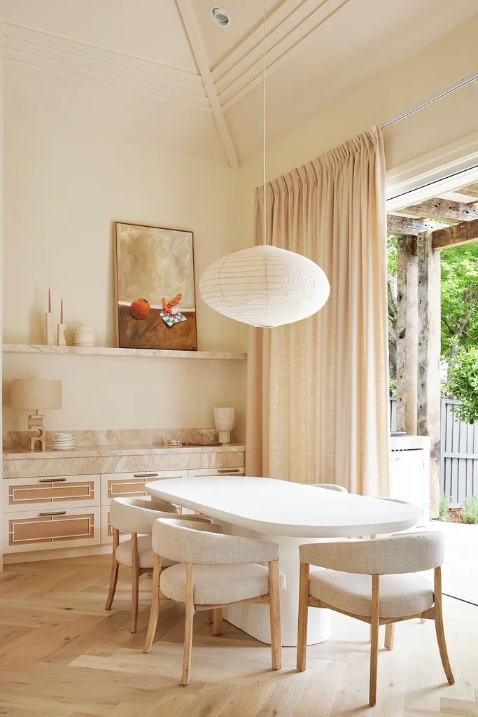
Don’t forget your home’s existing features
Rather than selecting a paint colour in isolation, Three Birds recommends considering every permanent element already in your home.
“Timbers, stone, tiles and metals all play a part in how a colour looks, so your neutrals need to work with them, not against them.”
THREE BIRDS RENOVATIONS
Natural timber ceilings, warm stone fireplaces and timber flooring all influence whether a paint colour feels balanced once it’s on the wall.
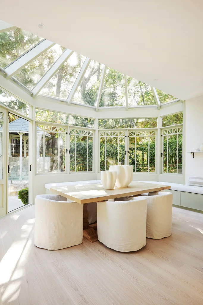
The easiest way to make a neutral room feel layered
A neutral palette doesn’t have to feel flat. Three Birds recommends combining different strengths of similar shades throughout your home rather than relying on a single white everywhere.
Their favourite combinations include:
| Look | Colours |
| Warm and timeless | Dulux Antique White U.S.A.® + natural timber |
| Soft and versatile | Dulux Natural White™ + Dulux Buff It |
| Crisp contemporary | Dulux Lexicon® Quarter |
| Nature-inspired | Dulux Still with warm neutral whites |
Texture also plays an equally important role. Layering timber, linen, boucle, wool and ceramics helps create warmth that paint alone can’t achieve.
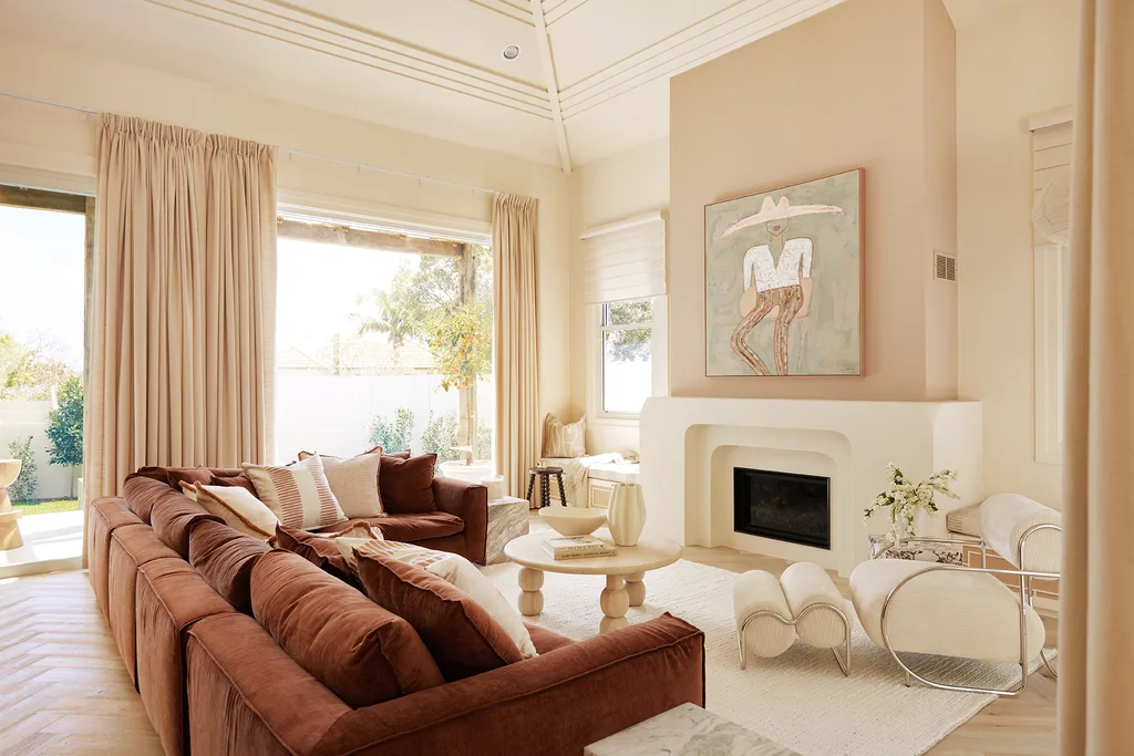
Ready to move beyond beige?
Neutral doesn’t necessarily mean white. Three Birds says homeowners wanting a little more personality are increasingly turning towards earthy colours that still feel timeless.
Some of their current favourites include:
- Dulux Still, a calming nature-inspired green
- Dulux Scallywag Half, a sophisticated warm yellow
- Dulux Spanish Olive
- Dulux Terra Rosa, an earthy clay tone
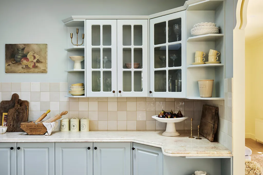
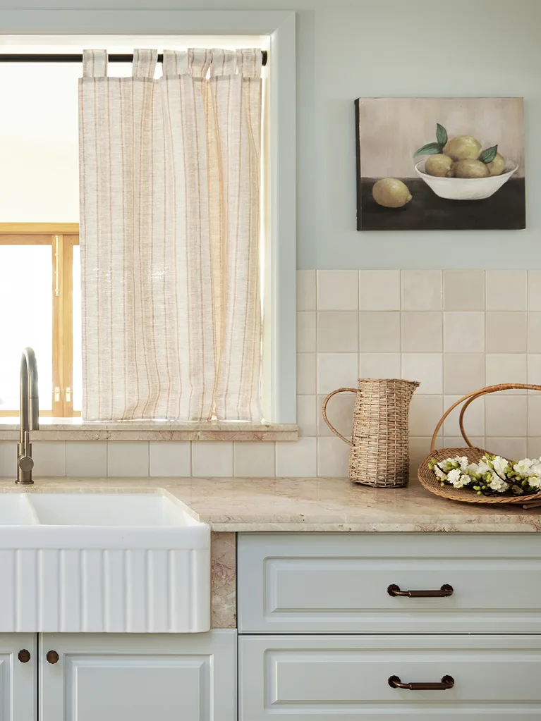
The biggest lesson from the makeover isn’t that every room needs new furniture or expensive renovations. Sometimes the most dramatic transformation comes from changing the backdrop. A carefully chosen paint colour can completely shift how a space feels—and that’s one of the few home improvements you can genuinely finish in a weekend.