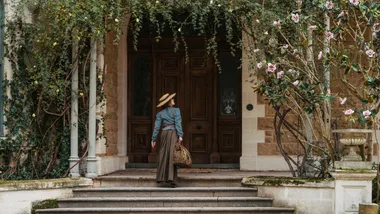
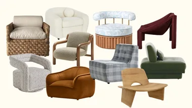
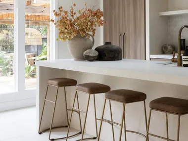
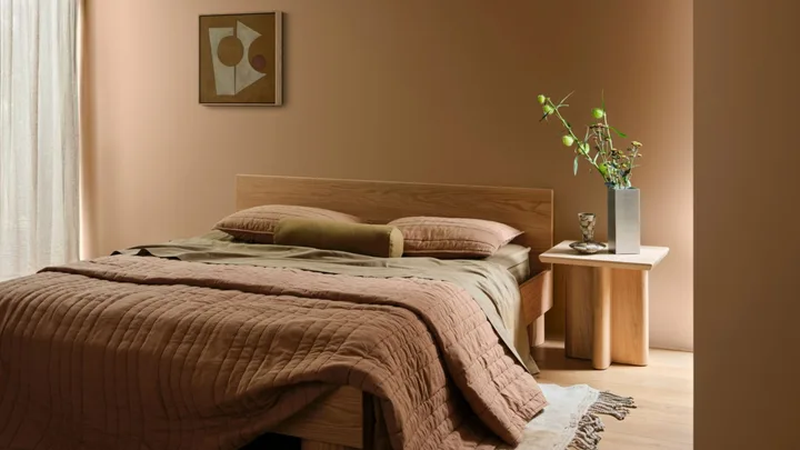
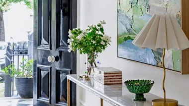
 Photography: Lisa Cohen / Styling: Bree Banfield / Artwork: 'Interplay 01' by Berny Bacic, Fenton & Fenton
In an age of algorithmic sameness and AI’s uncanny perfection, the Dulux Colour Forecast for 2027 offers a welcome return to emotionally charged interiors. “We’re moving away from perfection-driven, digitally curated spaces and instead creating interiors that reflect who we are, how we live and what matters to us,” says Dulux colour and design manager, Lauren Treloar.
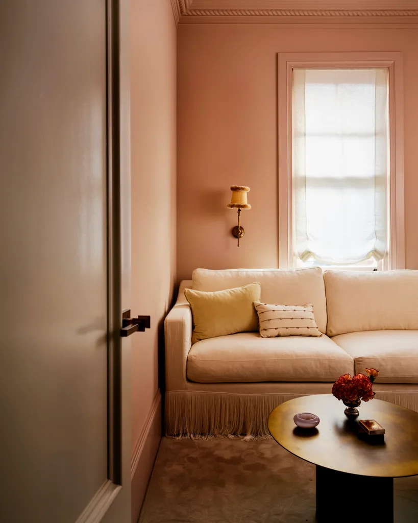
Smac Studio principal designer Shona McElroy agrees. “It’s less about creating a beige, quiet space and more about designing a home that makes you want to actually switch off and spend time in it.” Read on as Lauren and Shona break down the three Dulux palettes and how they correspond to 2027’s design direction.
“I think pastels are becoming dirtier and more grown up. I like using them on cabinetry, ceilings or an entire room”
SHONA McELROY, INTERIOR DESIGNER
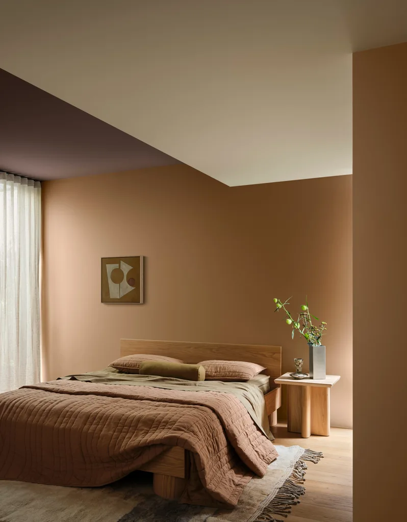
Sensory Delight
The Dulux Sensory palette urges you to disconnect the wifi and reconnect with loved ones, infusing your spaces with a calming air. “People want their homes to feel like an antidote to their phones,” says Shona. “For me, that’s warmth, tactility and atmosphere – natural materials, rugs, curtains and layered lighting.” Soft neutral tones, botanical greens and grounding near-black browns form this earth-inspired design direction, “with a focus on material calm, honesty and craftsmanship,” says Lauren. Think honed stone, organic timbers, refined weaves, smoked glass and textured tiles. With handcrafted details, matte surfaces and finishes such as brushed brass, these relaxed spaces encourage simple daily rituals, like lighting candles or brewing a pot of tea. “Ultimately, it’s about finding moments of stillness and clarity within the home,” says Lauren.
Micro-trend
QUIET CORNER
“There’s a renaissance of gentle grids and Japanese-inspired latticework bringing quiet order, balance and a sense of intention to interiors,” says Lauren. These subtle geometric patterns are emerging in wallpaper and fabric designs, as well as architectural elements like timber room dividers, creating cohesive spaces that are never chaotic.
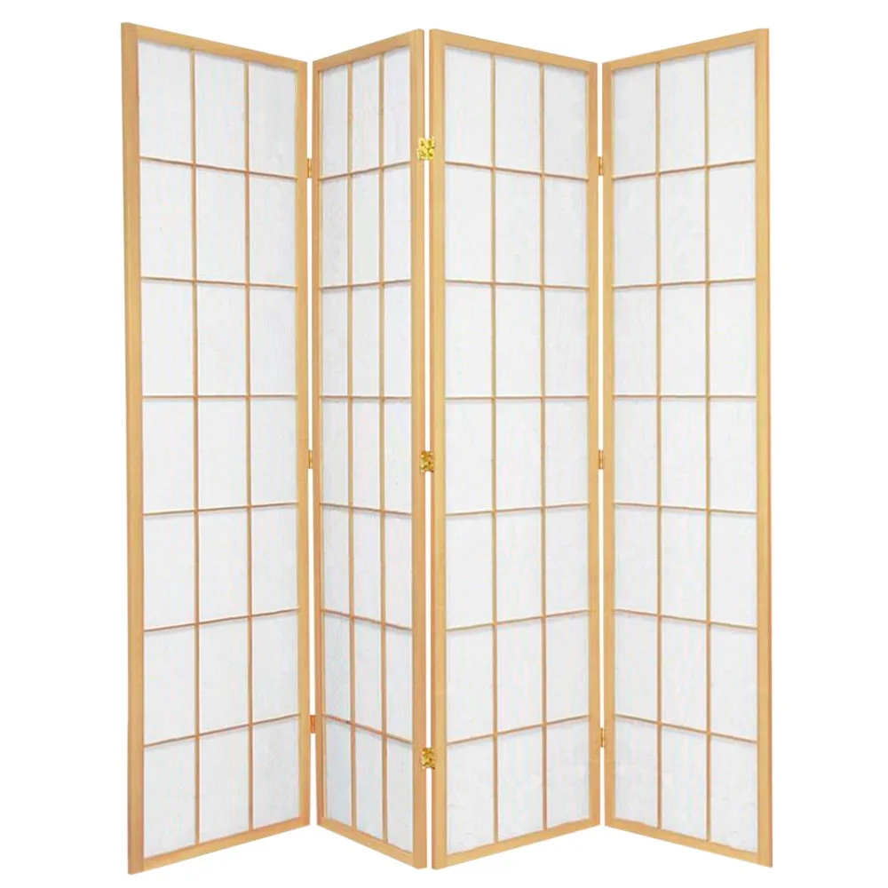
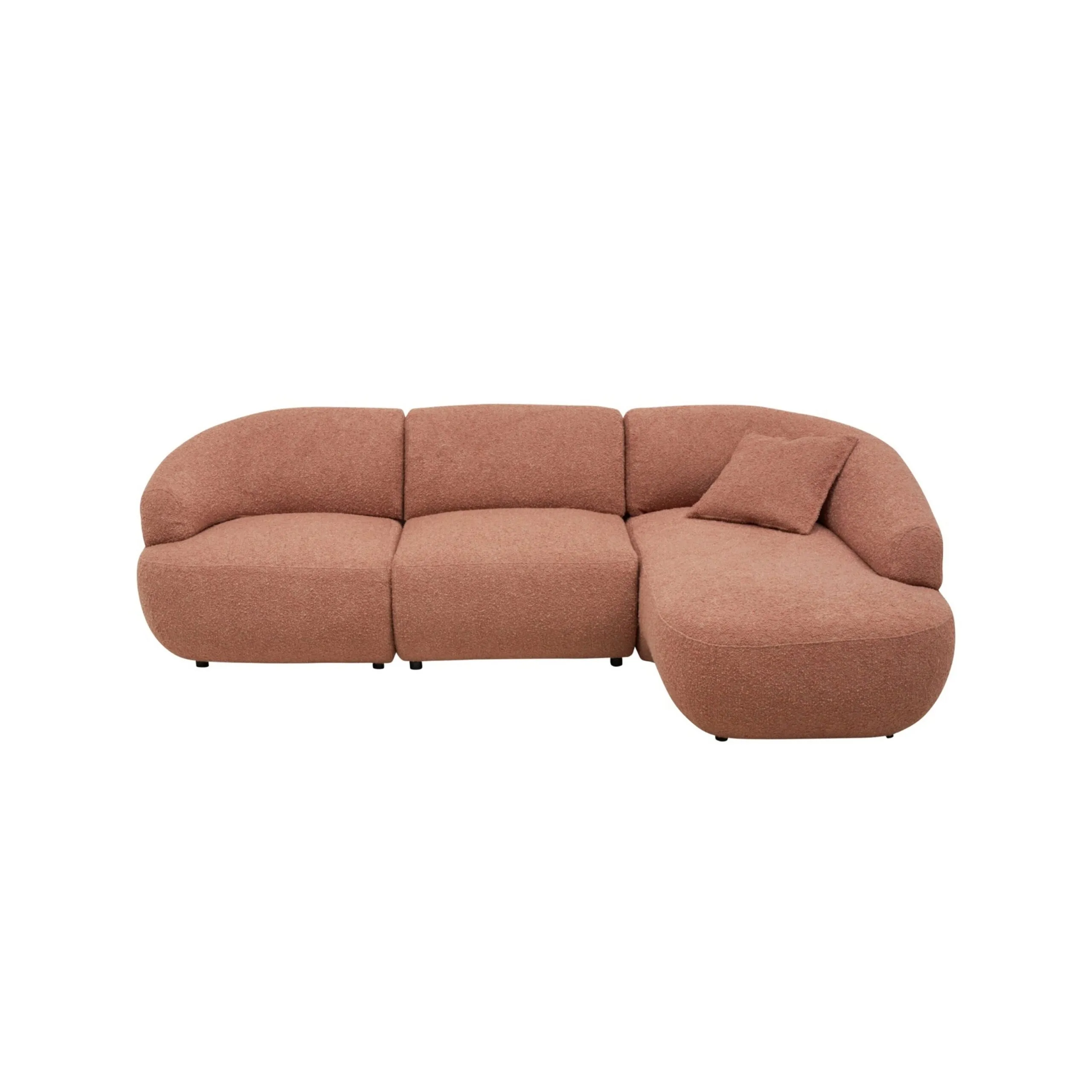
Storage Co 4-panel ‘Shoji’ room divider in Natural, Temple & Webster, $327. King Living ‘Aura’ modular sofa in Lennox Salmon, from $7475. Dulux Wash&Wear paint in Ecru, $114.21/4L.
Play along
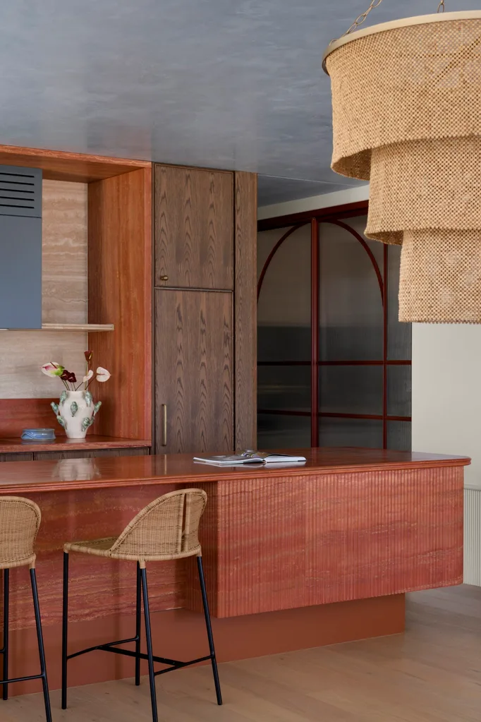
Daring to disrupt, the Dulux Play palette is full of ardent tones, encouraging lively interiors made to suit a vibrant existence. “It’s about creating spaces that feel human and joyful,” explains Lauren. “It reminds us that there’s beauty in life’s glorious imperfections.” The spirited look is defined by stately lilacs, calming blues and spearmint greens, and is accented with zesty orange and lush berry. Uniquely applied materials, from silicone and coloured glass to stone, enhance the energy. Expect wonky hand-painted elements, delightfully unexpected moments of contrasting colour, and modular furniture that encourages spontaneity and movement. “We’ve had years of quite safe, tonal interiors and I think people are ready for more guts,” shares Shona.
Micro-trend
BLUE WAVE
It’s blue-sky thinking for 2027, with this versatile oceanic hue in the spotlight. “I love the layered use of blues throughout a space,” says Lauren. “We’re seeing a resurgence of blue in all its shades, and this tonal approach is a beautiful way to create depth, dimension, and cohesion.”
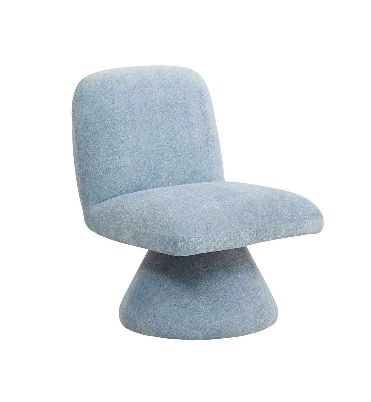
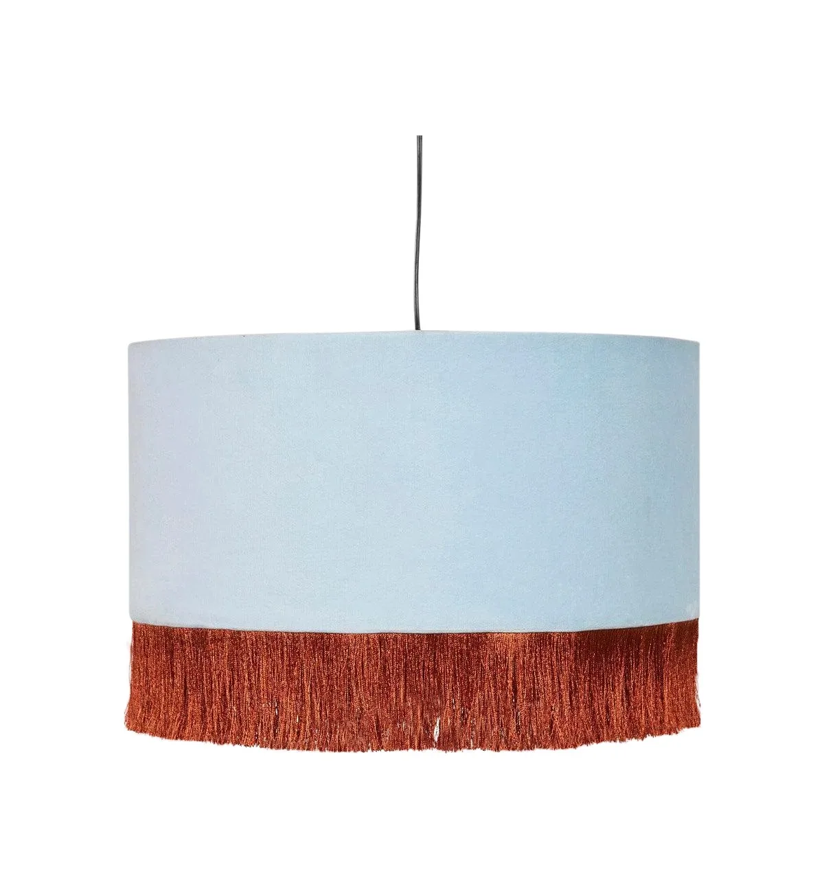
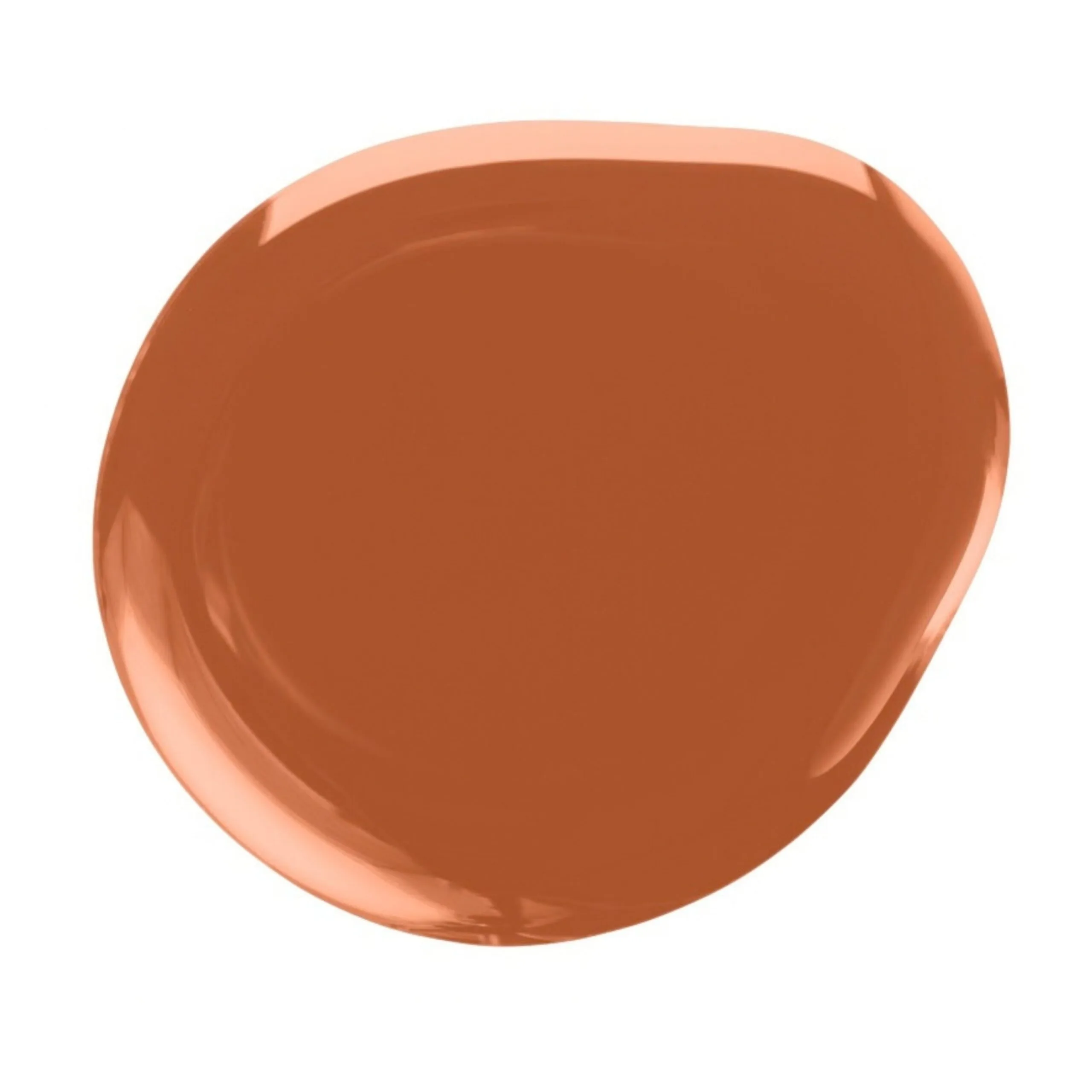
Fenton & Fenton ‘Margot’ occasional chair in Powder Blue, $890 and ‘Brady’ pendant light in Powder Blue, $220. Dulux Wash&Wear paint in Temptress, $135.74/4L.
Treasure trove
If minimalism leaves you feeling cold, though full-blown maximalism induces a headache, the refined maximalism of the Dulux Treasure palette may be your design sweet spot. It champions characterful interiors layered with personal narratives and modern reimaginings of the past. Shona sees colour becoming deeper, richer and more confidently applied. “I’m really excited by jewel tones like deep purples, turquoise and rich blues alongside yellows, ochres and mustards,” she enthuses. This sensibility sees expressive marbles, mixed metals and high-gloss finishes as an ideal backdrop for curated heirlooms and meaningful collected pieces. “There’s a sense of drama and theatricality, balanced by comfort and a feeling of being enveloped,” says Lauren
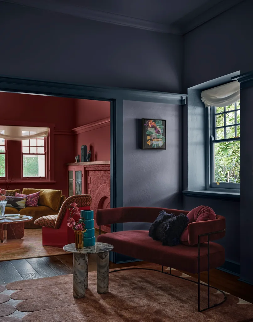
Micro-trend
HOT GLOSS
The theatrics of high-gloss paints and lacquers are now taking centrestage. Paired with rich velvets, elegant drapery and fringed details, mirror-like surfaces add elegance to any space. “There’s a growing popularity around seeing paint as more than simply colour on a wall, with different finishes helping influence the atmosphere and experience of a room,” explains Lauren.
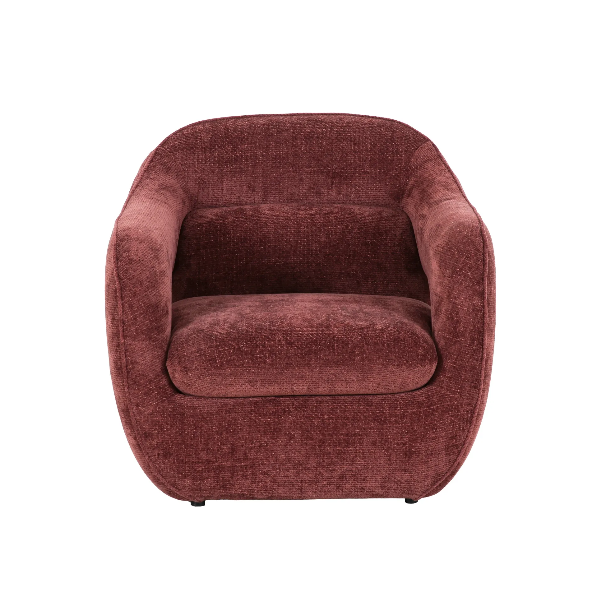
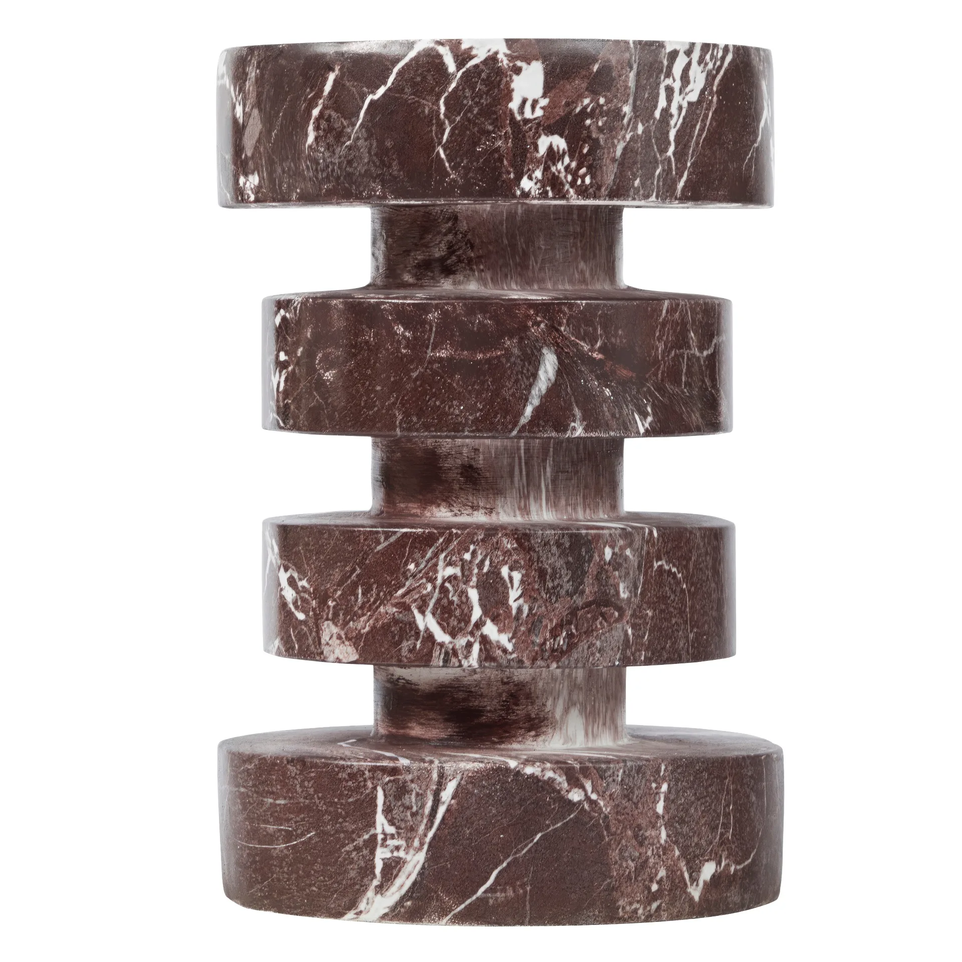
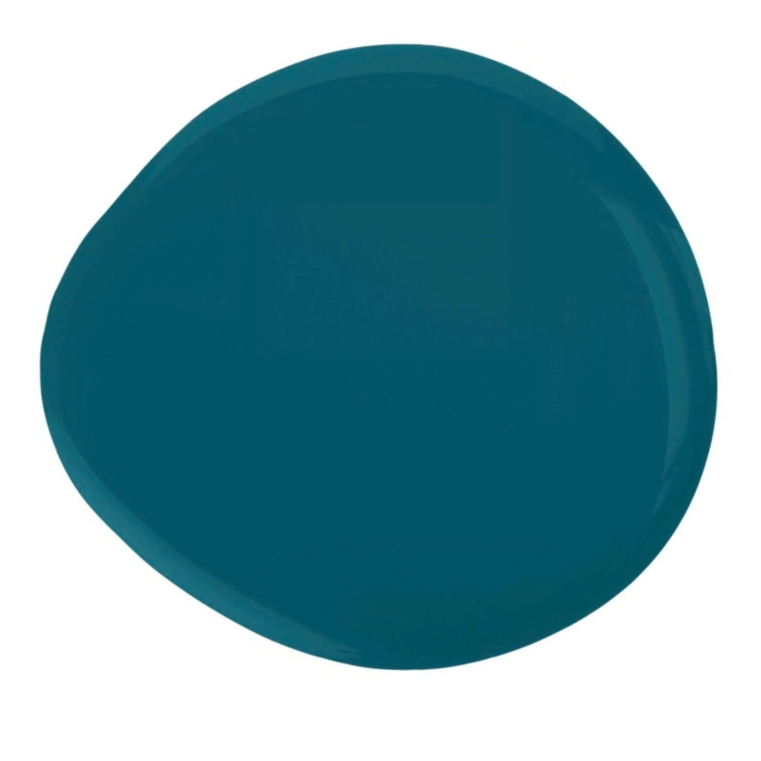
Campiello Designs ‘Silelia’ occasional chair in Lila Burgundy, $1039. Cooper & Co ‘Kopargo’ side table in Red, $159, both Freedom. Dulux Wash&Wear paint in Plunge, $134.68/4L.

Be the first to read this story by subscribing to Home Beautiful magazine

Related stories

Native ad body.
Native ad body.

Native ad body.