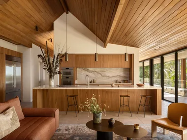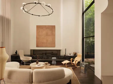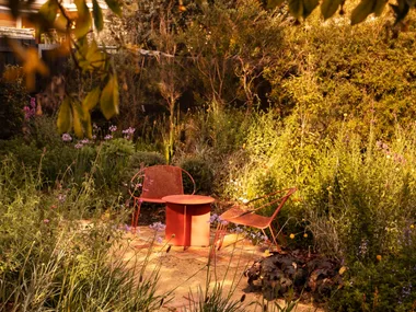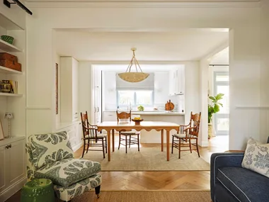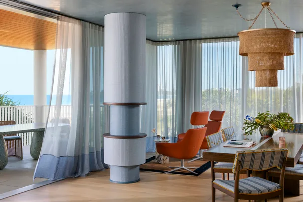
When visionary designer Carlene Duffy was approached to cast a transformative spell over this new Gold Coast apartment, inspiration emanated from a gallery-worthy assemblage of artworks cherished by the owner, a widowed grandfather.
As the director and creative force behind Carlene Duffy Studio says, “For ideas, we naturally drew on the owner’s art collection, which is quite dynamic and varied. The collection was a real indicator – as it usually is – of how far we could take the homeowner in terms of the interiors. It informed his style sensibility – he loves not only art but quirky, unique pieces.”
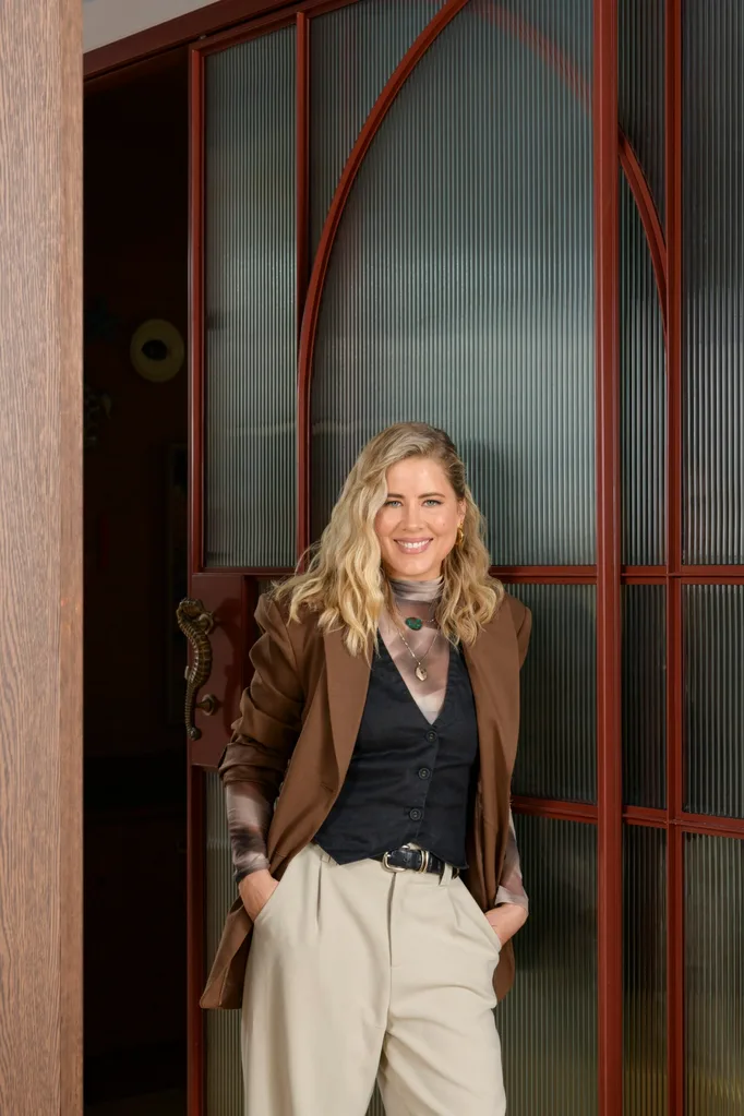
Rising directly above the Queensland foreshore to draw in vast panoramas of the Pacific Ocean, the apartment’s location is, as they say, as good as it gets. “There’s no road between the building and the sea,” explains Carlene. “The views are all the way along the coastline – they’re pretty incredible.” It’s little wonder that with a significant makeover on the cards encompassing both the apartment’s interior design and decoration, Carlene and her team were excited to begin. “This was our ultimate brief,” she says.
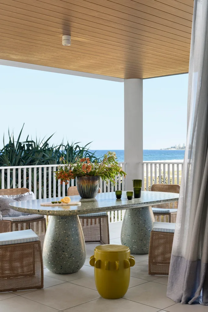
“We had to have this custom-made terrazzo table by Crosini craned in – and I was too nervous to watch!” reveals Carlene with a laugh. “It’s so heavy, with the amazing curved pillars. It’s a real art piece.” Globe West ‘Tide Isle’ chairs partner with seat cushions in ‘Belladonna’ outdoor fabric by The Textile & Design Studio. The homeowner’s old drum side table received a sunny face lift, painted in Resene Stinger. Hallway Bold hues flow inside, with steel-framed doors in the hall finished in Dulux Duralloy Manor Red.
DRIVE BEHIND THE DESIGN
During mid-2023, the owner approached Carlene’s design studio after he received a recommendation from a family member. “He knew from the moment he bought the apartment off the plan that he didn’t want to live with the specified finishes,” says Carlene. “It was always all about the position for him.” While the four-bedroom home provided ample space to both retreat and entertain, with airy living domains as well as a generous sea-facing terrace, the aesthetic seemed to lack a sense of soul. “It was all very beige,” says Carlene. “The owner has such treasured memories of his grandparents’ home and how interesting it was, and he wanted his own apartment to be one that his grandchildren would always remember.” As for fulfilling his own desires for the space, the quality of the materials was very important to him. “He wanted a higher level of finishes than what had been specified for the apartment, so it was also about making it feel more true to him.”
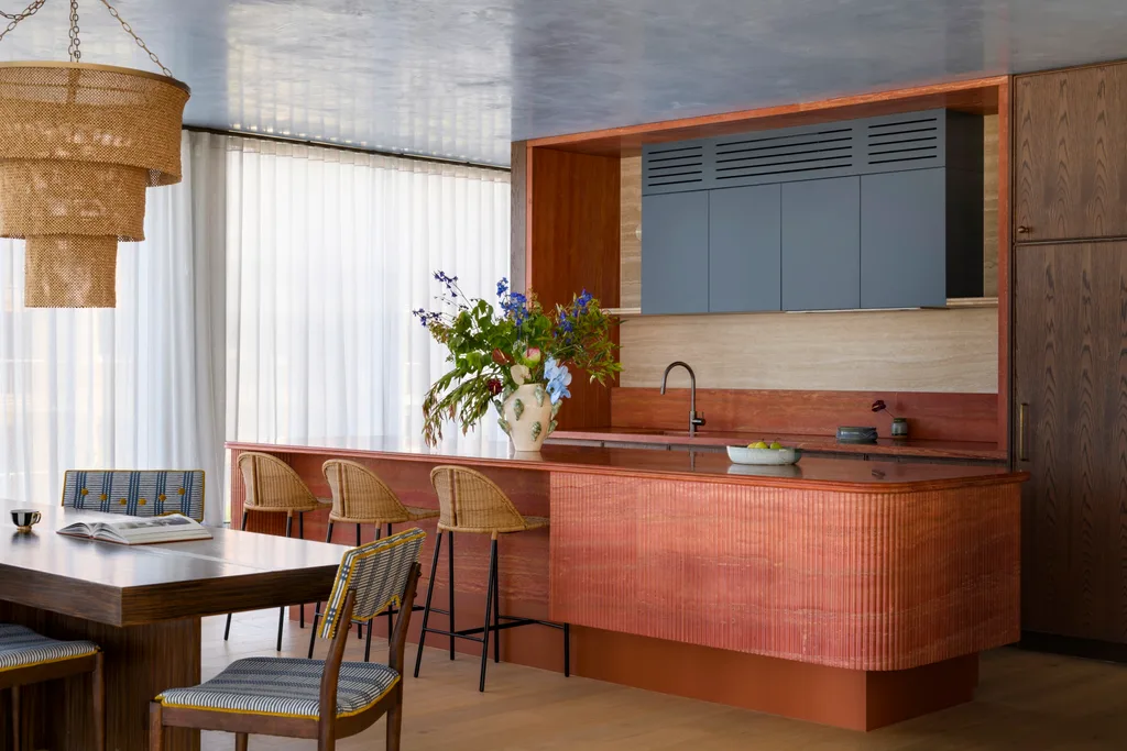
“The kitchen is a departure from the typical coastal interior,” says Carlene. “The level of detail feels sophisticated, without being uptight.” Red Travertine from Signorino clads the island and its fluted sides, as well as the rear benchtop, to provide a rich, earthy contrast to the upper splashback in Classic Travertine from Four 2 Stone. The heart of the home is completed with a ‘Yokato’ pullout tap from Brodware in Aged Iron. ‘Ines’ bar stools from Satara make the island bench a social spot.
“The powder blue of the ceiling works well with the warmth of the walnut timber.”
CARLENE DUFFY, DESIGNER
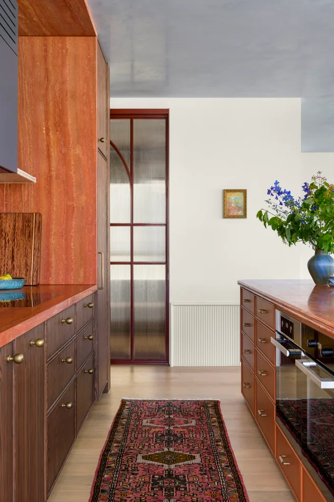
The colours are picked up in a runner from AU Rugs and a petite artwork the owner found in Italy, which hangs near powder coated steel-framed glass doors that lead into the media room.
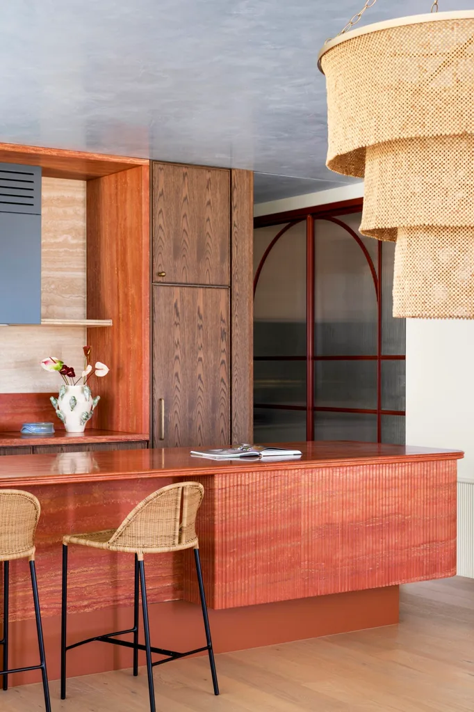
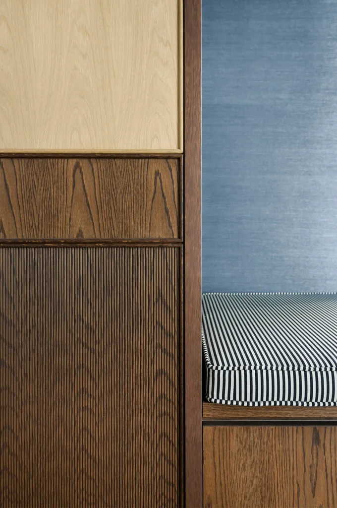
Carlene bookended the kitchen joinery with handsome cabinetry in ‘Polo Oak’ profiles in a walnut stain from Farmers Doors, offset by a wash of grey-blue tones. “One of my team members suggested the deep navy for the kitchen overheads, and it just works so well,” she says of the upper cabinetry concealing the rangehood, hand-painted in Dulux Copycat.
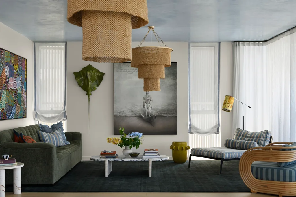
The living area’s misty hues are reflected in a large artwork by Michael Cook. To its left is a Michael Eather wall sculpture and the owner’s treasured artwork by Minnie Pwerle. Curtains in Chivasso ‘Endless Ocean’ in Colour CH3010/091 with banding in ‘Tussah Linen’ in Powder – both Unique Fabrics – perfect the scene.
PLANNING PROCESS
With the layout remaining largely intact, the works were predominantly of a cosmetic nature, which eliminated the need for council permits or approvals. “The butler’s kitchen had a double entry, which we closed off to provide more space within that area,” says Carlene. “Cosmetically, though, we ended up redoing everything except for the bathrooms, which remain as they were originally specified according to the developer’s plan.” It was apparent to Carlene, too, that the owner has long had an affinity for ornamental colours. “He didn’t need to tell us that,” she says with a smile. “He has orange leather armchairs, which are very sentimental to him – and I love that! You can see that someone is open to colour by how they have lived before and also from their art collection.”
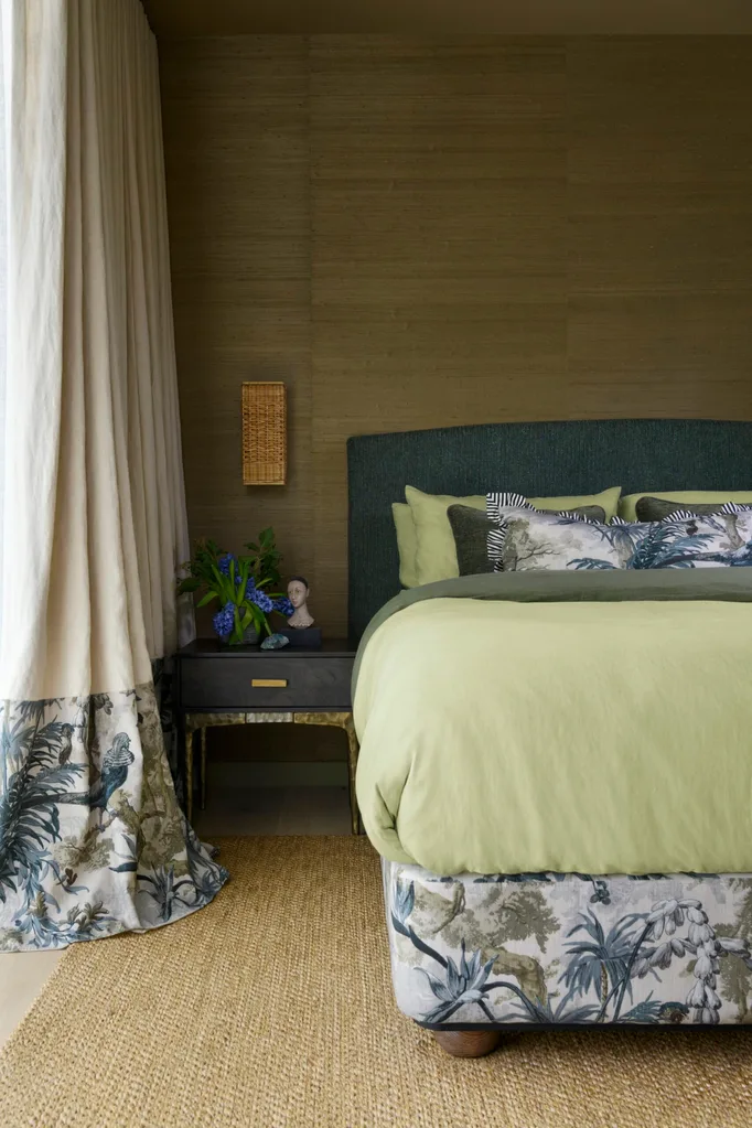
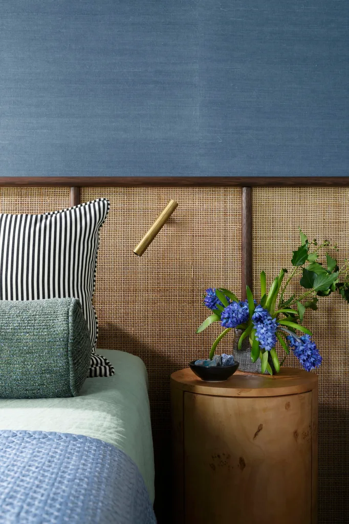
Warwick Fabrics ‘Glyndebourne’ fabric in Forest is brought to verdant life on the bed base, cushions and curtain trim in the guest room. Carlene re-covered the owner’s bedhead in Chivasso ‘Gentle Dream’ in Colour CH3057/031 from Unique Fabrics. A sisal rug from Natural Floorcoverings Centres anchors the space beneath Porter’s Paints Grasscloth wallpaper.
SPECIAL FEATURES
From the first meeting, everyone agreed the apartment would be the beneficiary of a dramatic and highly distinctive makeover. Joyfully, the unique character of the transformation reveals itself from the first step inside the front door. Surprises unfold at every turn and each domain is enlivened by defining layers of decorative details, from striking patterns and standout textures to bursts of vivid colours and bold materials. There’s the contrasting mix of deep navy and rich walnut-stained cabinetry in the kitchen, offset by a coral-red travertine island complete with a fluted stone front. There are the sumptuous soft furnishings – including grasscloth wallpaper and floaty linen drapery – which deliver a cocooning sense of calm to the bedrooms and to the media room. And, suspended from a powder-blue Venetian plastered ceiling in the open-plan living zone, a sculptural duo of intricately beaded pendant lights casts a glow above arguably the most unexpected feature of all – a blue mosaic-tiled support pillar that presents as art in itself.
BEST SAVES
Throughout the apartment, an eye-catching amalgamation of old and new weaves an intriguing tale. “The style of the decor is definitely contemporary – like the building itself – but with some classical elements,” says Carlene. “We re-covered a lot of the owner’s existing furniture, which we love to do as it minimises waste. The only pieces he didn’t want re-covered were the two orange vintage leather armchairs. I love that element in a home, where certain pieces remain exactly as they always were for sentimental reasons.” Using existing art was not only a north star for the design process, it also rewarded the client with substantial decorating savings. “We were given such an open brief from the owner, who was thrilled to have much of his art included in the apartment,” says Carlene.
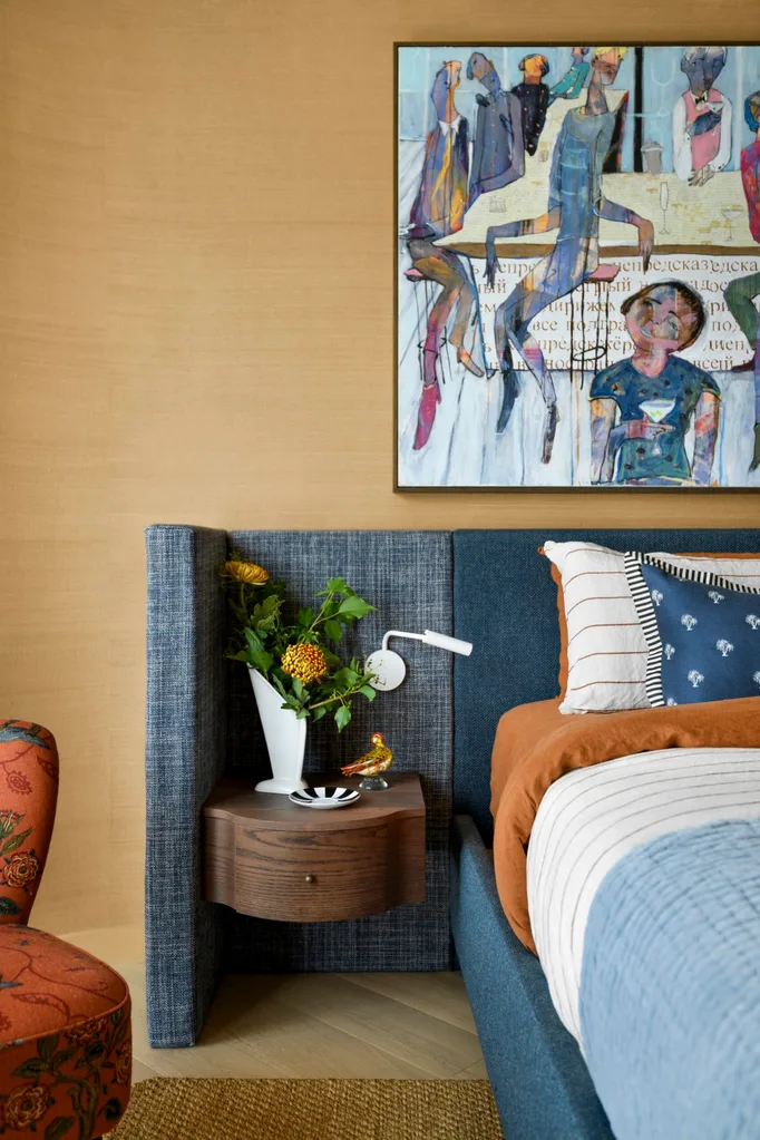
‘Bar Scene’ by Ilya Volykhine claims pride of place in the main bedroom, which is wrapped in Grasscloth wallpaper in Camel from Porter’s Paints. The bespoke bedhead contrasts in Unique Fabrics ‘Sunnyboy’ and ‘Feel Free’ textiles.
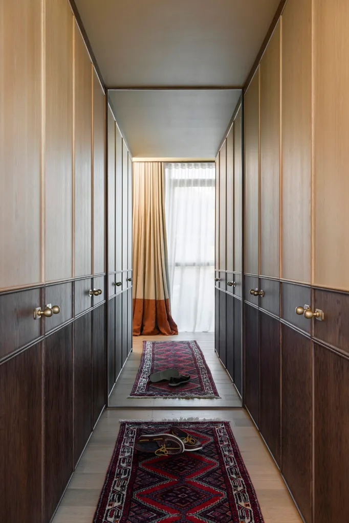
The richly detailed walk-in robe is crafted from ‘Polo Oak’ profiles by Farmers Doors, with an oak finish on the upper panels and a walnut stain on the middle and lower sections. The lower portions also feature tactile, reeded profiles. Drapes by Elfi Curtains are in Alhambra ‘Candela’ fabric in Colours 66 and 18 from Elliott Clarke.
BEST SPLURGES
Although high-end furniture and impressive artworks make strong visual statements, it’s the custom detailing throughout that signifies an extra level of care and consideration. “We added fluted wall panelling and, to all the door arcs, a bullnose trim, which feels very sophisticated and elevated,” explains Carlene. “We introduced powdercoated steel framed glass doors in Dulux Duralloy Manor Red to the media room. We also knew very early on that we were going to do the blue Venetian plaster ceiling in all the common areas. It’s about the whole picture.
LESSONS LEARNT
Design experts will agree that a home should speak clearly of its inhabitants. “The style is quite eclectic, which is definitely true of the owner’s personal style,” says Carlene. “There’s a vibe you can take from someone. He absolutely didn’t want ‘cookie-cutter’. If he did, he could have just lived with what was originally specified by the developer.” Are there any rules when it comes to placing bolder patterns and stronger hues in a space? “If you’re mixing patterns, you want to aim for a combination of large- and small-scale ones, rather than large-on-large or small-on-small,” says Carlene. “We don’t choose colour lightly. We make sure we sample everything on site, so we’re selecting colour within the quality of natural light that each space receives.” With the sand and sea literally on its doorstep, this is a home that now celebrates its exuberant heart. A home with interiors as unforgettable as its setting.
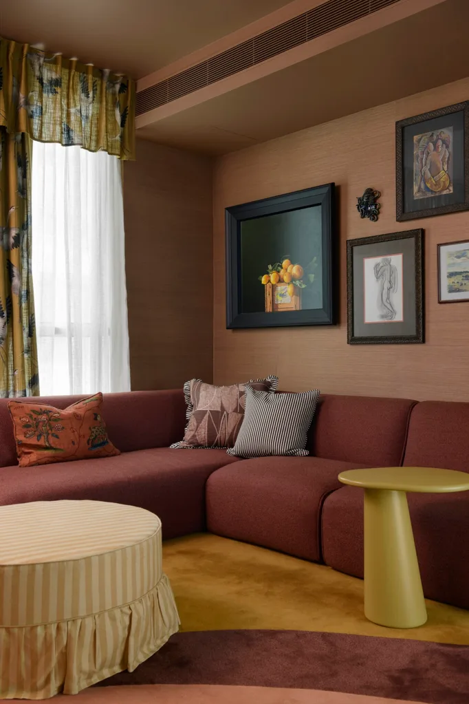
A zesty Geoff Williams artwork teams with an octopus sculpture by Wilder Isla and two vintage works. The small landscape holds sentimental value, being by the owner’s father.
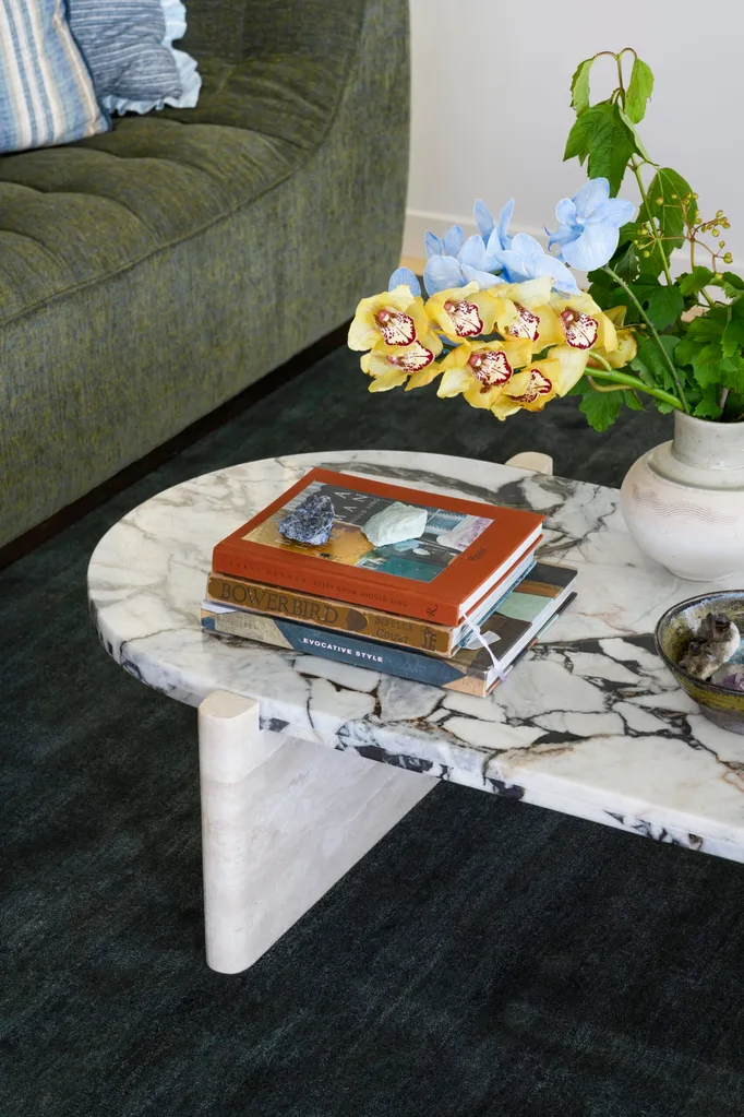
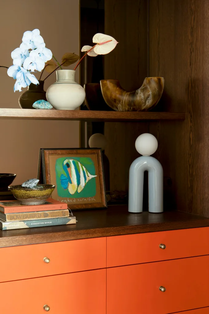
At the entrance mirror-backed shelves offer a place to style vignettes. Here, a Steve Barwell artwork, curios and a Dinosaur Designs ‘Branch’ vase create a warm welcome.
Source book – your trusted directory to help you find the best team to help create your dream home
Interior design: Carlene Duffy Studio, carleneduffy.com
Builder and Joiner: Precision Palms Joinery, precisionpalmsjoinery.com.au

Be the first to read this story by subscribing to Home Beautiful magazine

Related stories
Native ad body.
Native ad body.
Your home exterior has more potential than you think
Native ad body.