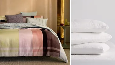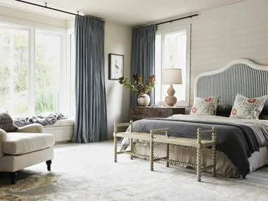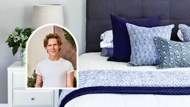
When it comes to bedding, the safe bet has long been solid, minimalist neutrals. But the tides have turned toward something with a little more pizzazz: linear patterns.
Save on styling with these finds:
- Save up to 50% in Pillow Talk Winter Sale
- Save up to 40% in Sheet Society Winter Edit Sale
- Save up to 50% on Hommey’s Archive Sale
If the idea of styling striped bedding triggers a bit of design anxiety, you aren’t alone. It’s a choice that often requires a distinct departure from our ‘safe zone.’ Yet, introducing stripes is much easier than you’d think.
From rich berry hues to sophisticated chocolate tones, the secret lies not in rewriting your room’s entire script, but in understanding stripe weights and complementary palettes. Whether you are a colour maximalist or a die-hard neutral devotee, here is how to make the season’s biggest bedding trend work for your space.
Palette 1: Warm neutrals & chocolates
If you’re open to fun bedding but simply can’t shake your undying allegiance to neutrals, I understand, I sympathise, and, most importantly, I’ve tracked down a couple of striped quilt covers that I think even you will like.
If I were opting for neutral striped bedding, I’d use it to anchor a modern, refined coastal aesthetic. Instead of the predictable blue-based nautical look, a crisp cream quilt cover with warm chocolate stripes can bring a grounded, sun-baked warmth to a room; less ‘beach shack’ and more ‘Mediterranean summer,’ if you catch my drift. This works particularly well when you lean into the styling by pairing it with warm linen textures, jute rugs, and raw timber accents.
Pair with: cream and one other rich feature colour, e.g. ochre or chartreuse
Avoid: cool white, or any bright, vivid tones
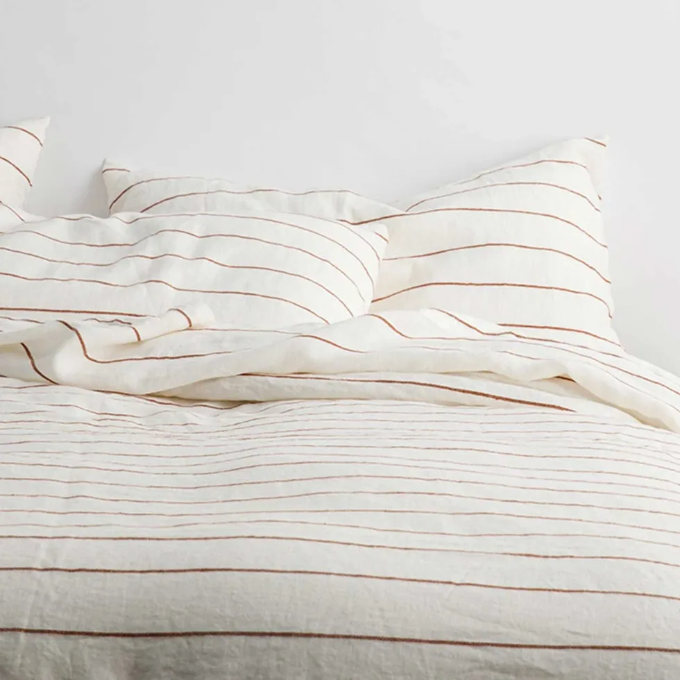
Cultiver Linen Striped Duvet Cover
Queen $360 at Cultiver
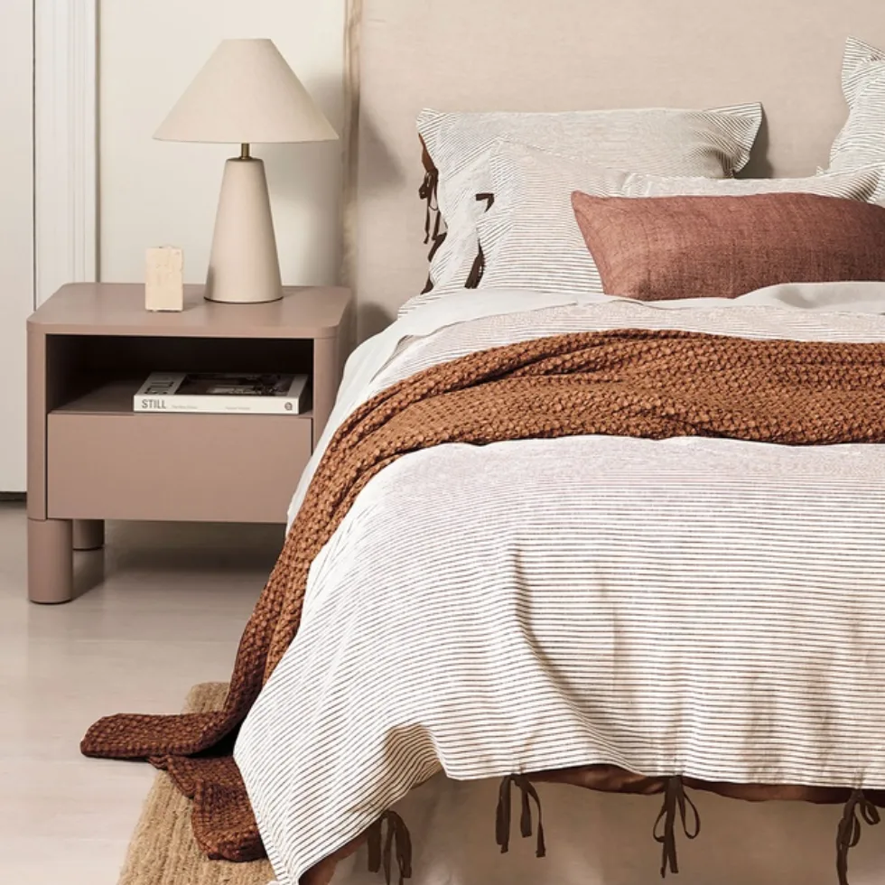
Aura Home Chambray Mini Stripe Quilt Cover
Queen $279 at THE ICONIC
Palette 2: Classic blue & white stripes
While I’m clearly a sucker for a berry tone, I’m equally fond of a soft, icy blue, especially when it’s paired with warm shades of cream and rich brown accents. But given my boyfriend’s inexplicable association of pale blue with ‘popsicles’ (his words, not mine), these sets simply weren’t on the table for me this year.
And while, yes, I did promise to ease up on the ‘my way or the highway’ approach to homeware shopping, I am very tempted by the Adria Reversible Quilt Cover Set. And judging by the speed at which Pillow Talk’s other striped bedding sets sold out, I won’t have long to lock down my preferred blue bedding.
Pair with: chocolate or terracotta, cream, wooden accents
Avoid: cool white
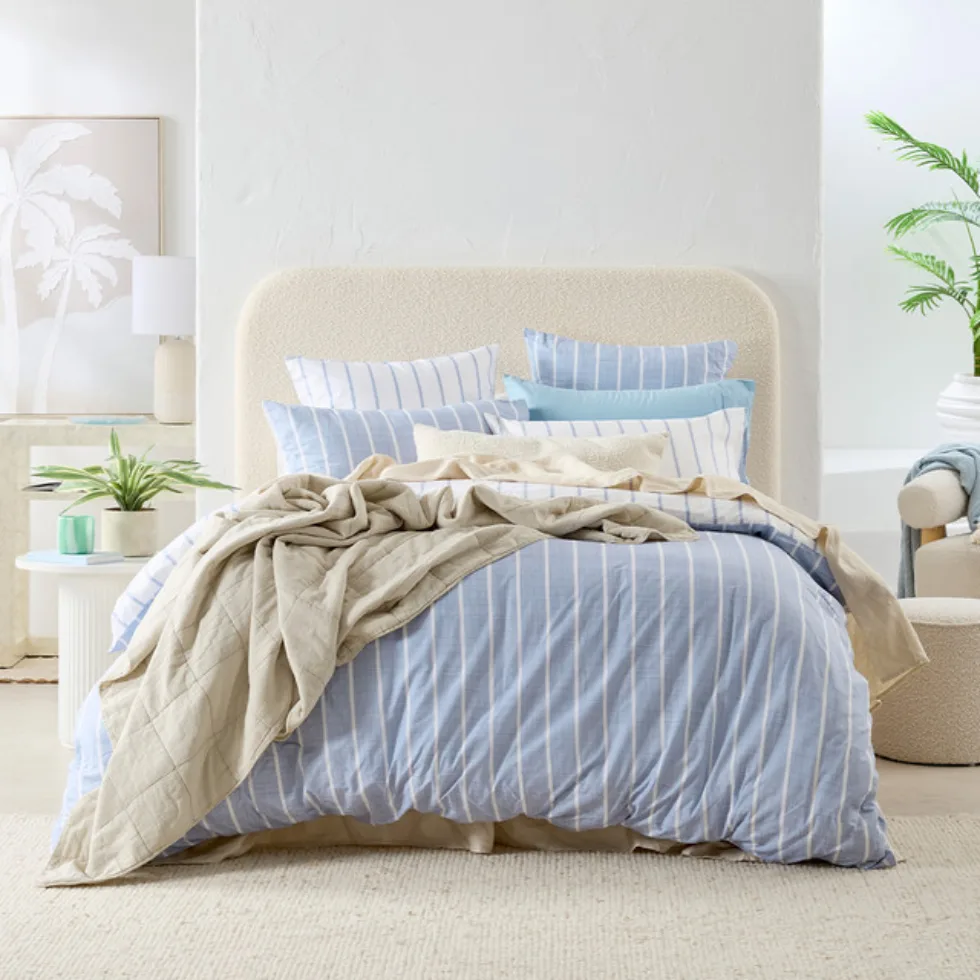
Pillow Talk Adria Quilt Cover Set
Queen $119.95 at Pillow Talk
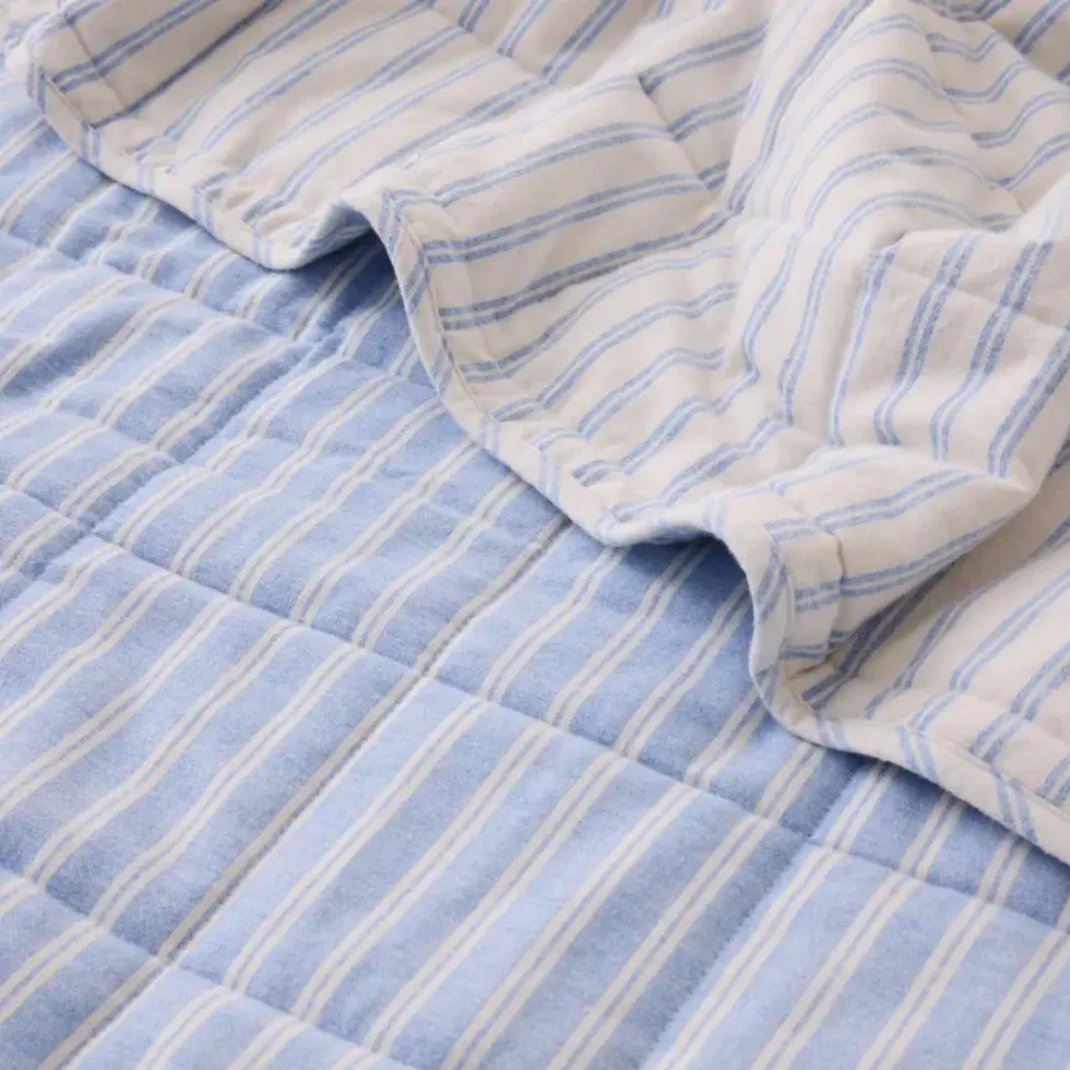
Sheet Society Jimmy Stripe Bed Cover
Queen $126 (was $180) at Sheet Society
Palette 3: Pinks & berry hues
Berry tones have dominated interior trends during 2026, and I’d be perfectly content for them to continue doing so for the foreseeable future.
When styled right, softer berry hues can offer a refined aesthetic that, for me, feels ever-so-slightly nostalgic; like a beautiful, elegant variation of the pink-drenched room I dreamed of as a child. My only advice: let these colours do all the talking. Unless you’re opting for an eclectic aesthetic, layering other vibrant tones on top of your berry base can feel a tad intense.
Pair with: butter yellow, cream, and blush
Avoid: cool white, and highly saturated colours
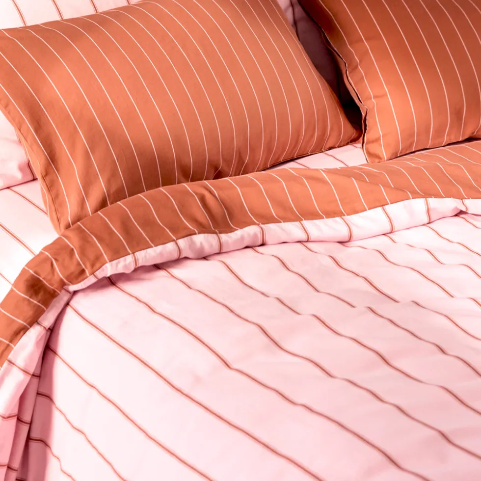
Hommey Striped Quilt Cover
from $94.50 (was $169) at Hommey
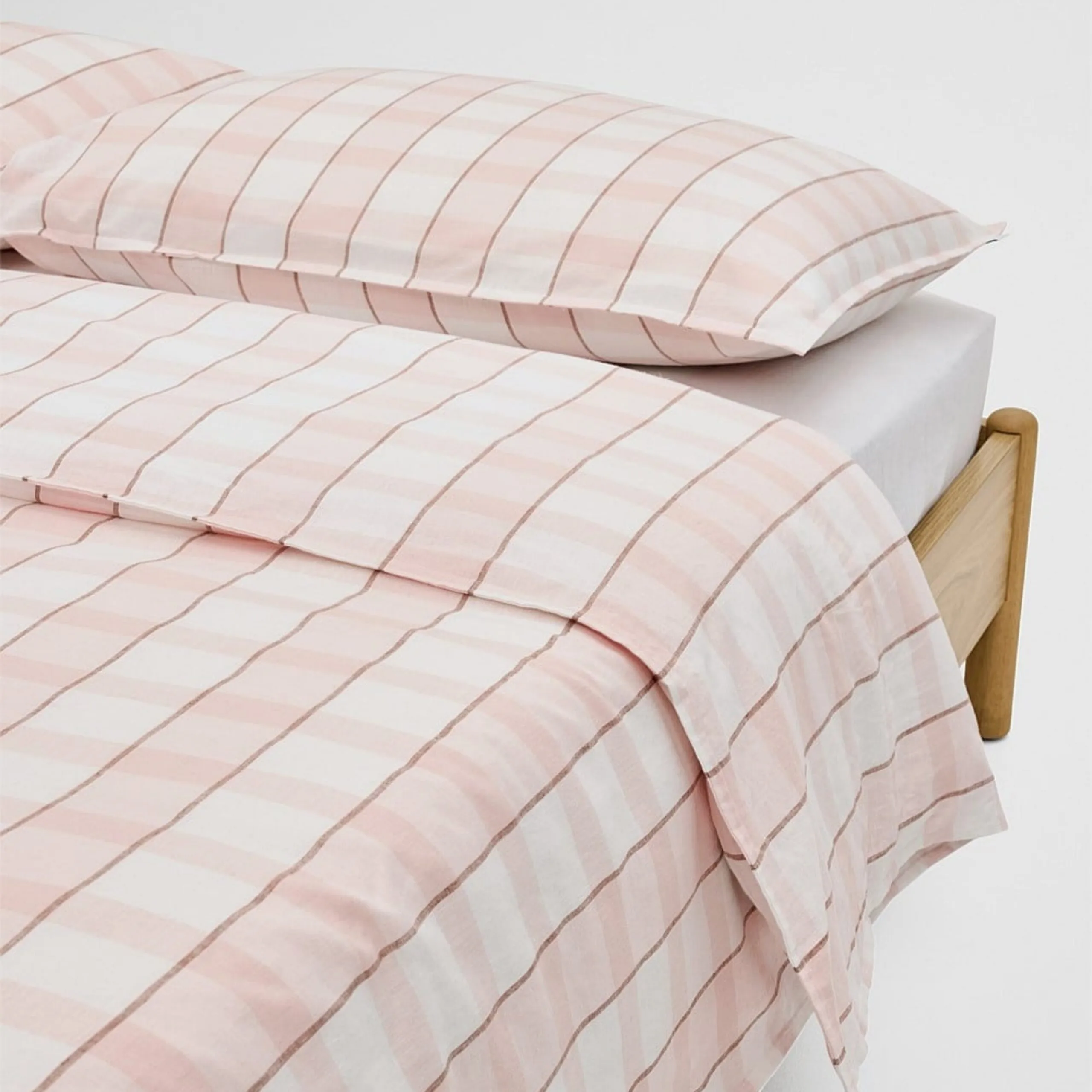
Country Road Nerida Striped Quilt Cover
Queen $249 at Country Road
How to make stripes work with your home’s palette
When cohabitating with a significant other, any major design choices (like a switch from boring bedding to something with a little more pizzazz) usually have to go through some form of pre-approval process, whether we like it or not.
To my utter dismay, my boyfriend does in fact have opinions about colours, patterns, and decor. Thus, for my next bedroom update, I had to be more intentional, especially when opting for patterns over the safe simplicity of solids. This meant leaning on a colour palette of berry tones, decadent chocolates, and other pre-approved hues we picked out together, and whipping up a vision board to avoid unwanted surprises from either side.
For our final choice, we opted for a striped quilt cover from Hommey, with matching striped sheets and pillowcases. In fact, you may recognise it as the one I styled during my recent review of Sheridan’s custom quilts.
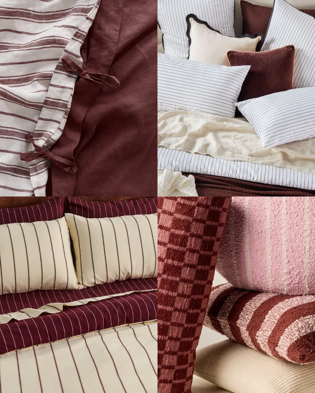
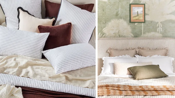
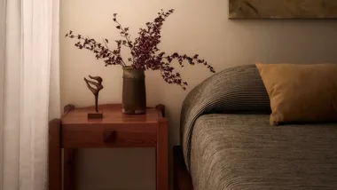
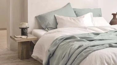
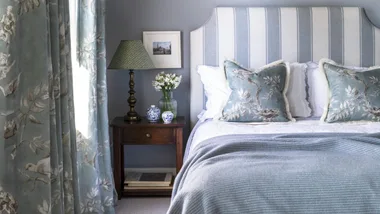
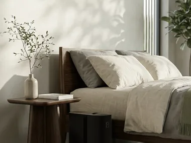
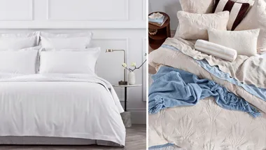
Top left: I Love Linen, Top right: Pillow Talk, Bottom left: Hommey, Bottom right: Sheet Society
Why it worked: While the striped pattern and rich berry colourway earn this Hommey bedding set ‘statement piece’ status, it didn’t clash with the neutral furniture that already existed in the space. And as I’m still selecting pieces to build out my master bedroom, I didn’t have to worry about complying with existing accent colours or patterns, which is a huge help for anyone dabbling in bolder design.
When it wouldn’t work: While I adore the new set in my master bedroom, it wouldn’t look anywhere near as good in my cramped guest room, as it has to be given room to breathe. Remember, opting for patterned bedding (especially in dark hues like this) can make small or cluttered spaces feel completely smothering.
A final note: When incorporating patterned bedding into an already-decorated space, the key is working with the colours that are already there rather than selecting a pretty colourway and reworking your whole space around it.
Understanding the visual impact of different stripe weights is equally essential. For smaller rooms, neutral pin-striped patterns look beautiful, but thick, dark stripes can make the space overwhelming. Alternatively, in large, neutral spaces, opting for a light cream quilt cover with very thin stripes can create a washed-out effect, but bold patterns look brilliant.
But whatever you do, try not to take it too seriously. Your home is your space, and if you want to pattern clash and break every rule in the book, do it. Although simple, having fun with how you style your bed is one of life’s little joys, and there’s no logic to stifling your creativity merely to adhere to a trend.

Related stories
Native ad body.

Native ad body.

Native ad body.